Tree of Savior Forum

Website Re-Design Poll

Hello. We are IMCGAMES TOS Team.

We thank you again for participating in the CBT 2. We are currently reviewing your input, suggestions and feedback very attentively.

On a related note, we have been receiving many suggestions for our official website from our users.

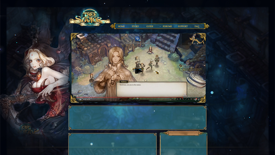
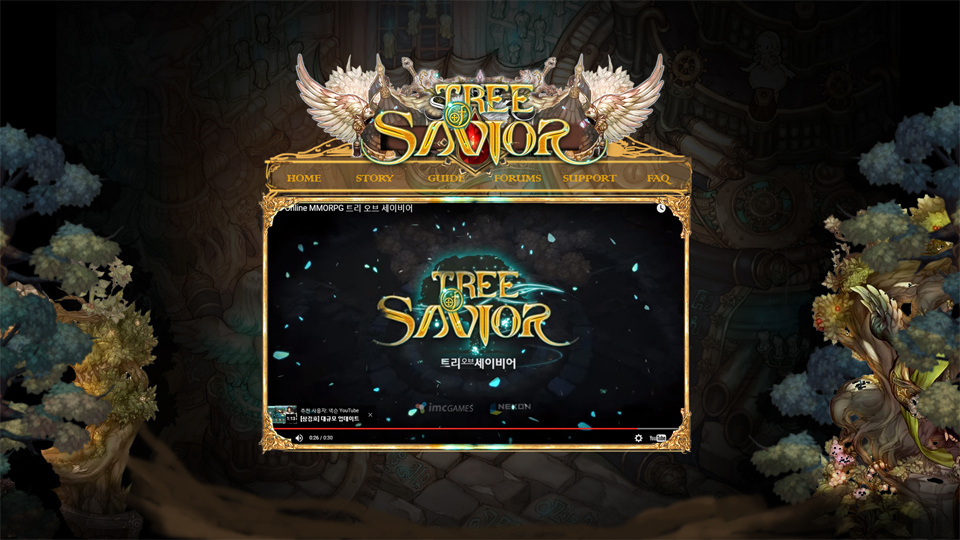
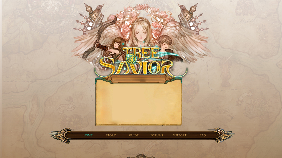
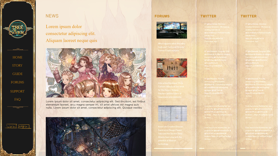
In order to reflect such suggestions, we are planning to renovate our official website. Internally, we came up with four proposals for the website renovation. The proposals are rough sketches and we would like to hear your opinions and preferences on them.

Please, vote on the poll below to let us know which one you would prefer.
Link : http://goo.gl/G9nIxa

Disclaimer: The proposals are still in the early stage and may differ from the final result. The poll is to understand and gain insight into our user’s preference.

Thank you.

18 Likes

1, enough said, or possibly 2
the others kinda hurt my eyes xD

1 Like

How will the forum look? I believe that’s a more pertinent question xD

7 Likes

Oh my, 4th is absolutely the worst IMO. Both the text and background have bright colors. My eyes can’t handle it.

I’m going for the 1st. It has good contrast and the choice of colors is perfect.
I also like the overall theme. It gives me this dark, but magical impression.

2 Likes

My vote is definitely for #1. The background does need to be a little bit more polished though (inverted logo). But a dark theme is great for the eyes.

I agree with @ttgmichael - If you are going to renew the website, please renew the layout of the forums as well. Here is an example > http://forums.gearboxsoftware.com/ < That community also uses the same forum software (Discourse) and see the possibilities.
The same background can be used for the forums as well to keep the consistency of the overall design. :smile:

3 Likes

I agree with the current votes that a darker color scheme like 1 and 2 is preferable.

For me, 2 almost hits the spot for me with its atmosphere (trees and stuff). But the logo, UI, and banner feels a bit overdone.
1 works great if we are aiming for a nightly feel to the site, it might get old seeing Giltine all the time imo xD.

Hmm, something in between 1 and 2 would work. The BG design of 2 with the logo and UI frames of 1

Number 2 is fine if not for those yellow colored menus (Home, Story, Guide, Forums, Support, FAQ) inside a golden (or brown?) colored banner/background.

For me, #1 or #2 are great. I don’t know why but I prefer something darker.

Between #1 and #2, I prefer #1.


I agree with @ttgmichael and @Spadow, forums should also follow the same website pattern. :smiley:

Color scheme wise, I prefer a brighter one, thus 3.

Layout wise, I prefer 1.

1 Like

My guess is the first and third design will get the most votes because the dark ones stand out more while the first one isn’t as crammed as the other, and the third option is the most clear and manageable one, even though, because of the bar at the bottom you would rely on a small news window.

However, you would do best if you could merge the community’s choice with an improved and clean-up version of the forth option.
You should have a news, forum and one(!) social media stream as well as a server status window on the front page without the need to click somewhere first.
The forum posts stream ought to be meaningful, though. For instance, a dev post tracker or topics with most comments of the day, etc.

You should also not forget the dark styles may be difficult to read/look at in bright environments so it is always best if you can offer both, a dark one and a bright one so people can switch based on the lighting around them.
As such, personally, I would like you to use the third option as an overall basis. Then, place the bar above the content window, enlarge the latter, let it be scrollable with the whole page, and add the info windows as described above. Lastly, create a dark version based on the second option.

1 Like

deff. the first or the second.
the others are too bright for my taste. °o° brrr - brightness :x:

The first of the second :smiley:

Can’t decide between First or Second. Love darker themes

Is 3rd supposed to be viewed on a cellphone or under a microscope?
1-2 are nice although too dark and both seem to waste too much space
Vertical navigation in 4th might be functional but doesn’t look good and the columns are way too narrow to read comfortably
I voted for 1 but honestly I have hard time choosing any.

I voted for 3, but it feels too empty. 2 was nice also, so try blending elements of both together.

1 Like

1st is ok but kinda old fashioned. Layout-wise i would’ve prefer 4th if you can fill columns with useful stuff. It’s harder to implement though.

yeah or they could change the background from time to time matching the events or occasion in game,

I think you should make 2 polls: 1 for layout and 1 for color scheme.

4 Likes

2 or 1 is fine by me

1’s UI using 2’s background.

4 Likes