As you can see, the webpage has been changed.
This topic is here to gather your feedback on the renewal. 
As you can see, the webpage has been changed.
This topic is here to gather your feedback on the renewal.
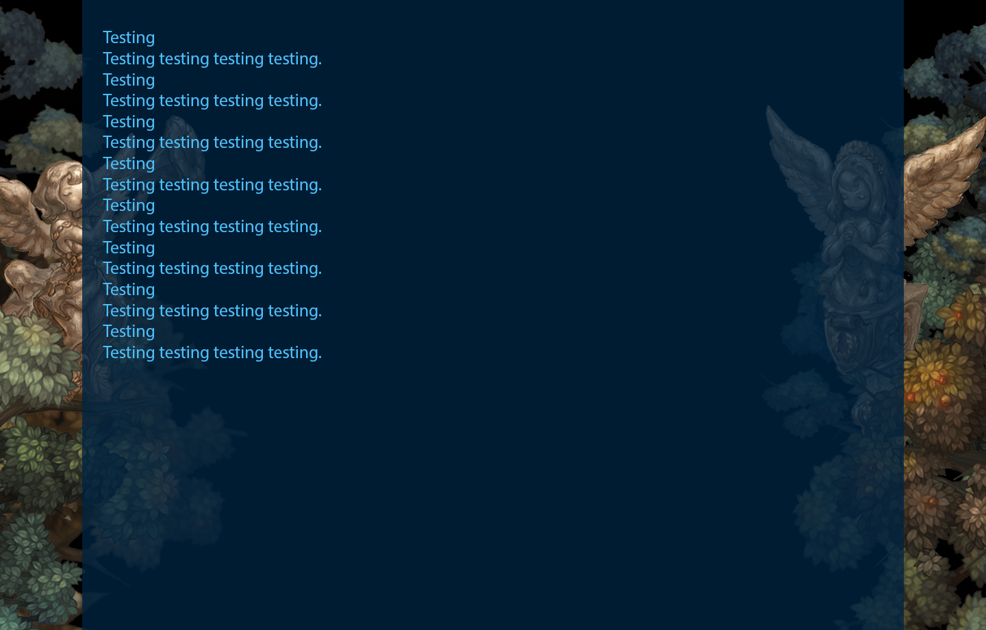
White text on blue background is suffering.
Background arts are nice.
Homepage is good, makes us want to play.
my only problem is that it takes a while to load because of the added images(which is nice). so all in all, it’s a pretty good job.
Dark and Blue as the night sky,
Light and White as beyond stars.
We shall embrace its elegance,
On hold, the Open Beta to come.
I like the dark themed colors because I can safely go to this website at night without blinding myself. It does look better than the previous one which was too plain.
Super minor complain:
When you flag someone. The options arent centered. I dont know if its supposed to be like this, Im somehow getting an OCD which I dont even have. My screen resolution is 1920x1080
(And no I did not flag Fairyhell)
I will never try to write a haiku ever again…
It’s very pretty! Really like it. 
A bit too much saturation and constrast for my tastes!
i love it
one thing tho i feel you could go with a better color with this i couldn’t read it that easily
I thought I was not going to like it when the voting was up but now that the new website finally arrived I must say that it is very pretty and enjoyable.
I love the new layout!
Isn’t as plain as the old one. The art, the colors. It’s just really nice to look at. 
its kinda hard to tell which topic is read or unread.
So far feels nice the new page, just the white is a bit hard on the eyes.
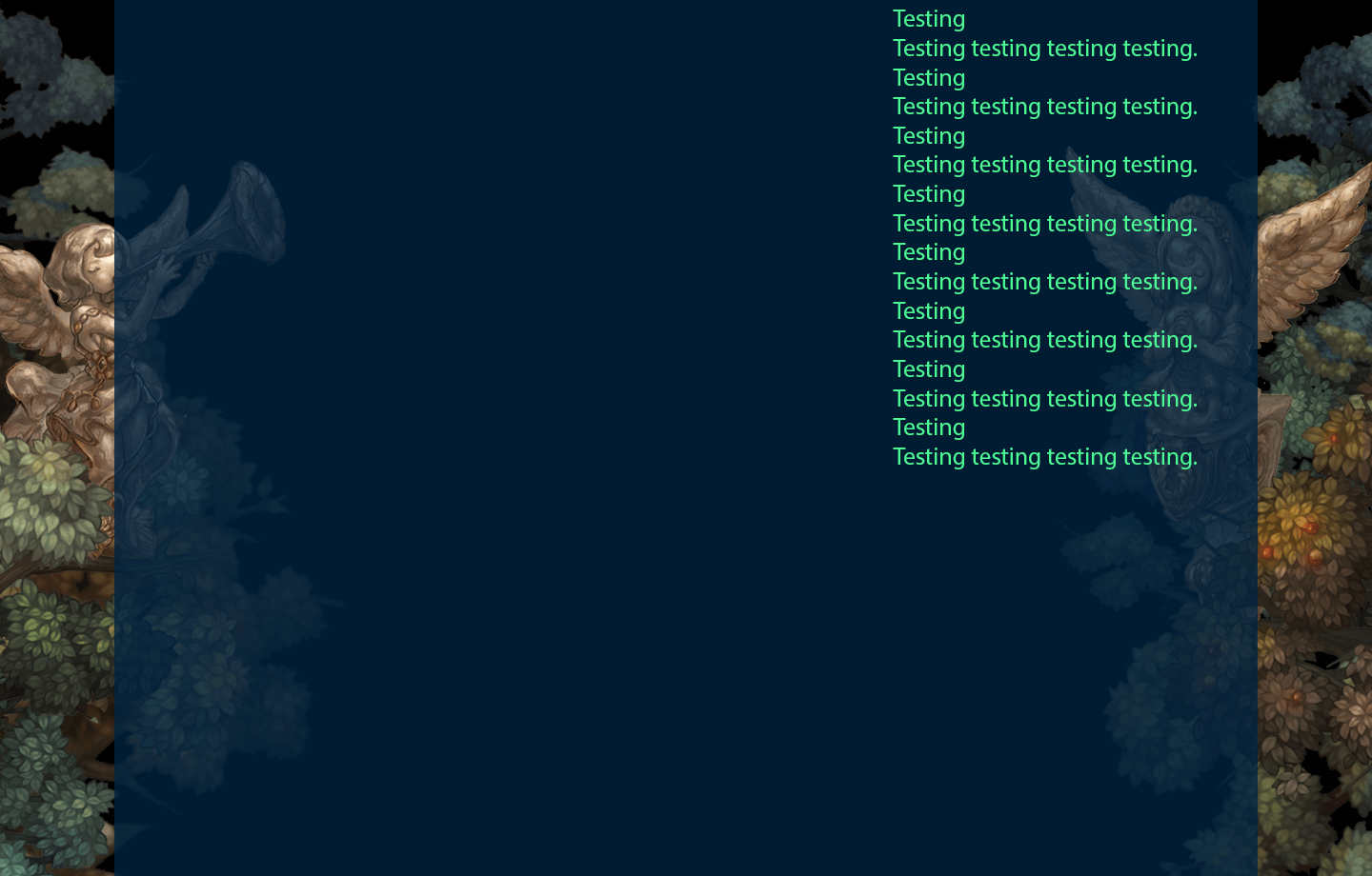
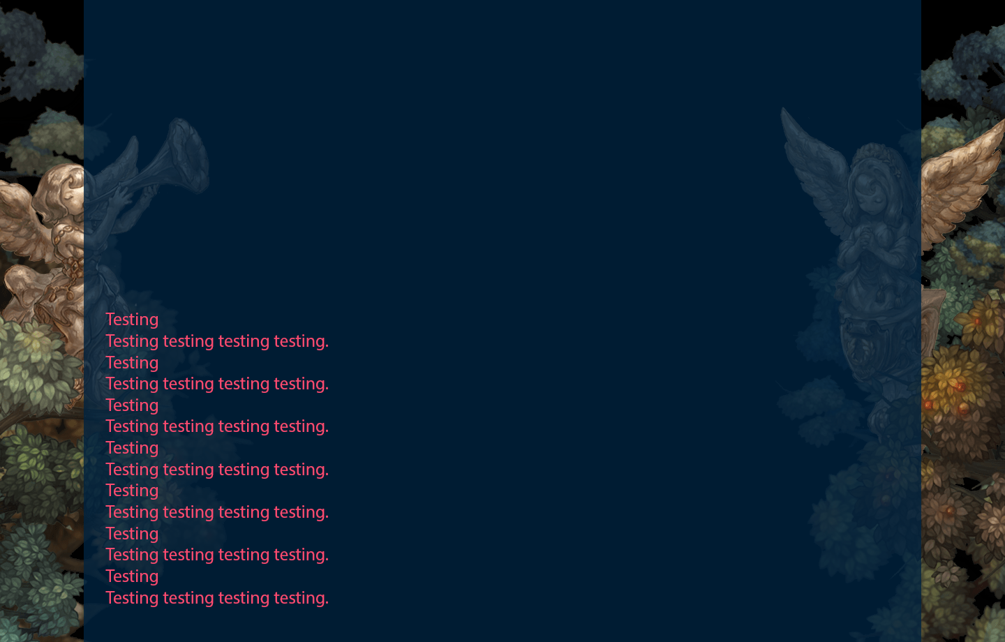
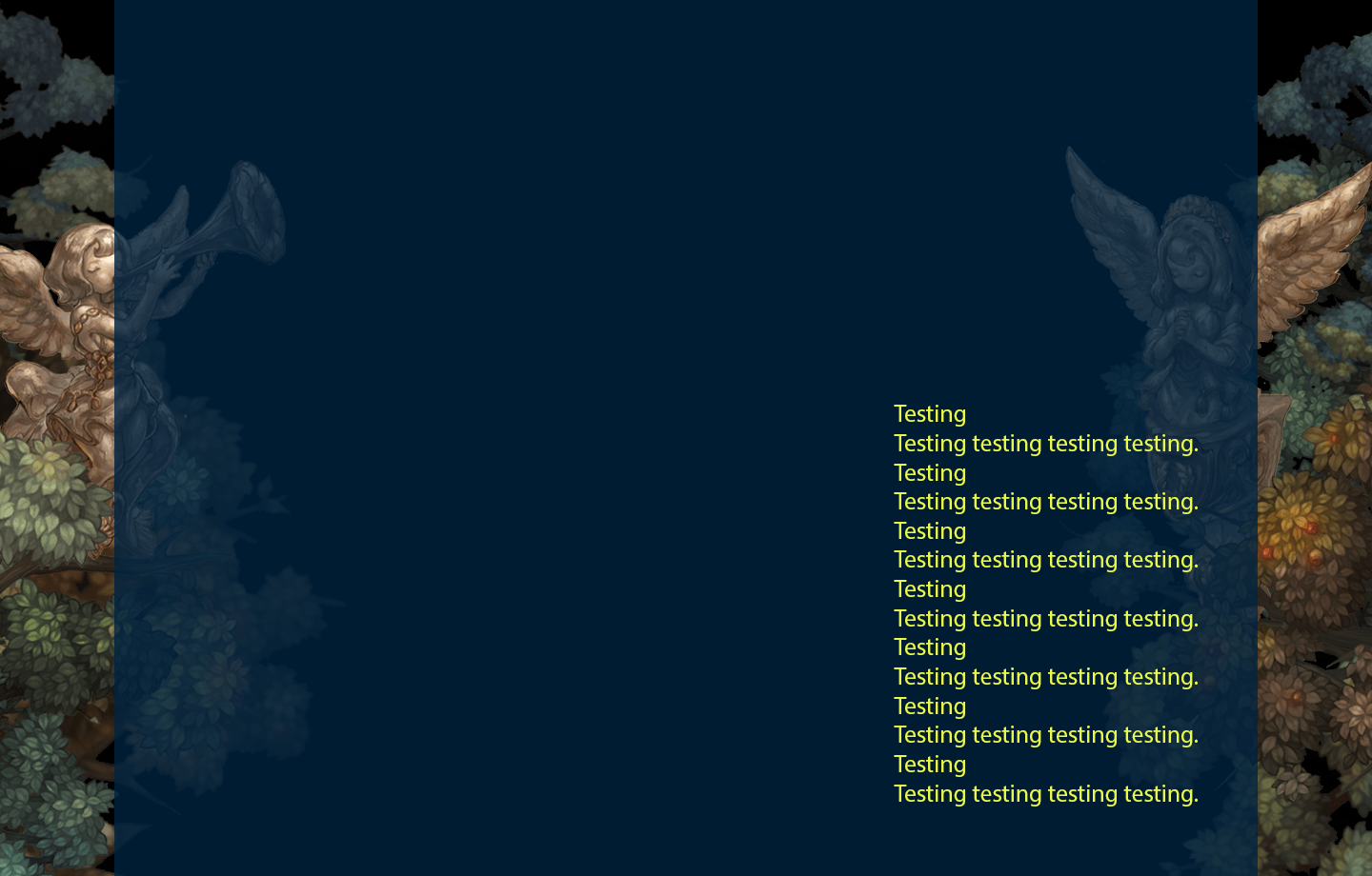
About the text color, i made some samples, i think the blue one looks good, its not hard on the eyes, you can try a darker variant of it to see how it looks:
PS: Thank you @Gunnr for the tip on the spoiler code (i hope i did it right lol). 

EDIT: The text was gray and the white background was because of stylish lol, sorry about that mistake.
I like the new theme but… RIP my cute emojis ![]()
No complain for me accept for one thing im sure most can agree of, which is the white text with the blue background kinda hurt the eyes, the blue is nice though, it is a cool colour, but mind changing the white? any darker colour in mind guys?
The sample 1 i posted there looks ok for me, or a bit darker than that i think would work well.
Think we could do something about the buttons though? They’re still obviously noticeable, but blue buttons on a blue BG seems odd. Lighten them up a bit; somewhere around [#8fc6f2].
This also seems like the perfect time for suggesting Plugins, but I probably shouldn’t Hijack you.
…Yet.
i think i liked the old forum better 
Could always put in a flavor system that lets users pick the general color combination. Like a pull down box on the side that lets you pick a color scheme. I’ll probably mod it myself with an addon called sylish later to fit my personal favorite.
But you can do cool stuff like call the schemes strawberry for your red tints, orange, or chocolate mint for people that want that obnoxious green on black. You know… a variety with both dark and light fonts as well as dark and light backgrounds. With a naming convention that’s makes the user want to experiment and personalize their own content. Appealing names that can communicate information clearly can help that a little.
Like I know I honestly I mostly used to reading light grey text on a dark grey background–boring but it’s the most calming for my eyes when it’s late night and I want to dim the lights and I don’t want to feel blinded. You could name that Silent Film or Charlie Chaplin. And instantly most people will know you’re talking about something that’s using all or mostly greys.