The old one was super SFW. The new one instantly betrays you just because of the color xD It is super well done though!
Any chance to get a purely white theme to choose as a secondary option?
The old one was super SFW. The new one instantly betrays you just because of the color xD It is super well done though!
Any chance to get a purely white theme to choose as a secondary option?
Loving it, it seems some dont like the white on blue, maybe make it a slightly darker shade of blue.
BIG improvement from the snowblindness that was the old forum though 
Its more the white text that hurt the eyes a bit, now for me and others is day time so it doesn’t hurt much but later at night and after the day we get our eyes a bit more tired and this white text will be a pain, a light bluish or a bit darker blue might do the trick, or some other color. The same blue color that our names appear on the post should do fine, if they exchange the post white color with the naming blue color it would be nice.
I think Hyperlinks could get a more distinctive color, they are very close to white.
Also, the transparent background makes me struggle a bit, if the opacity of could be increased, I would love it more, but I wouldn’t matter to me if the background didn’t get transparency at all…
While the new theme looks cool as hell, I think the theme isn’t suitable to keep lurking in the forums for extended periods of time, (which I do).
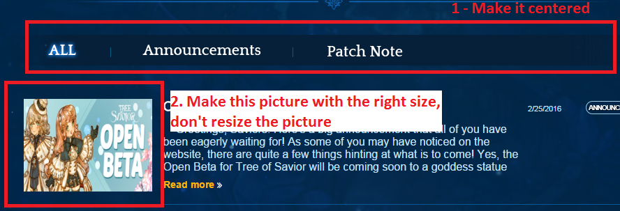
I hope this image (don’t judge my lame paint skills xD) transfer my feedback better than my words…
Yeah i guess a darker blue or something will suit well, but then again too many blue-ish kinda make it dull doesnt it? xD
I prefer it being dull than get my eyes in pain lol, well if there is another color that could go in there, maybe a dark green color or dark yellow.
I dont think yellow is gonna fit xD but yeah i guess being dull is better then ending up blind…
As i just paid attention, the green color of your avatar seem nice, maybe a bit more dark.
yeah my green is pretty cool colour, it could fit in just fine.
pls no  its hurting me already
omg MY EYES!! 
I don’t really like the new layout if my window isn’t maximized. It seems too simple :x But after I maximized my window it magically turned into something better. I also don’t like this gray box where I am writing ;-;
i will say this though, i wish the category tabs were available at the bottom of the page aswell, like under “Tracking”
the “news” menu link is bugged. It keep the bright effect after you mouse over it.
I love the new website.
I just wish the headline with website options like forum would still go down as it used to, especially on mobile. That feature was very convenient to me and I would love it back. It’s not nice that you’d have to scroll up which doesn’t work that nicely as Tomazelli mentioned earlier. I currently just go to earlier page but I’d rather just press the forums button when I’m at my last read post like I used to.
@STAFF_John
I think you should also have an option for a lighter color scheme.I think it fits better with the game personally,but it may also be useful to change in terms of screen brightness at day or night.
above 2 points, and:
it’s nice overall
thanks for the nice job
This post was flagged by the community and is temporarily hidden.
Talking about making it centered, I think the Tree of Savior logo could be in the middle instead on the left side and it’ll look better.