Tree of Savior Forum

KToS General Thread v4.0

Correct me if I am wrong:

One Hand Sword
-AOE Atk Ratio 2
-Pdef 248
-Strike attack 325
-10% chance to double crit for 5 seconds when using strike attacks

Bow
STR 65
Dex 121
Con 35
Crit Attack 452
Evasion 30

Shield
-con 42
-spr 72
-mdef 358
-finalblockrate 2%
5% chance to nullify debuffs up to rank 2

3 Likes

OMG its happening :heart_eyes:
monk intensifies

I wish this really happen…

1 Like

Hmm I assumed you were talking about the neww sword.

My Druid can’t wear Masinios sword because no attribute. You sure cleric can wear this?

Edit - and it’s actually 10% chance to double crit rate from strike attack.

Cleric cannot wear sw. See the icon.

Oh s**t… that’s right.
Usually Cleric can wield swords but there’s some swords that they can’t wield. Well, now is wait to see what the One/Two-handed Mace can give…

Evasion +30

For what purpose? There are low lvl weapons that give better evasion.

im talking about The silence applied by the Pull Rete attribute… lvl3 is too much!

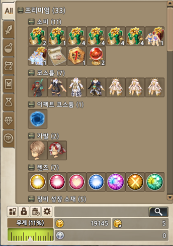
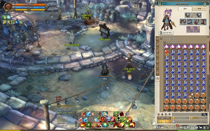
New UI update
index(4)
5557534784483229978
index(3)
index(2)
index

5 Likes

Looks good, but I hope it loads faster. Most of the stuttering issues are related to the spaghetti coding involved in how the inventory UI works.

:tired:

2 Likes

what @qq123520032002 posted above and

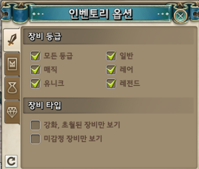
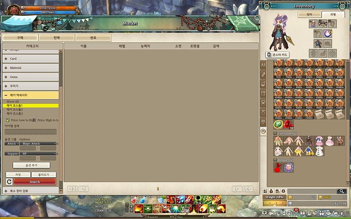
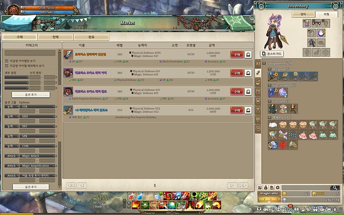
Market UI also improved, search filters added, more categories

not much else, Event stuff and BugFixes

Though google translated I think it’s clear what this meant:
“- All views have been removed . Therefore Marketplace UI when you first opened the invisible item is registered , you can not see the list of all items registered on the market as before .”

Damn. Now I can’t put items at prices higher than others and must resort to undercutting again. Common items like Kepa Doll, Potions, Enchant Scrolls etc can be put at higher price than others and it can still be easily sold in several days because there are people who don’t bother to filter / search. They see it pop up first page in the initial random list and they think the price is ok and straight away purchase it.

big inventory


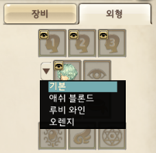
Hair 1 2 3 categories
Hair Stat filters


many search filters


Great UI updates. cant wait :satisfaction:

7 Likes

and Save&Load searchs

next week please IMC

1 Like

I like the change, it is very welcome, but I would prefer if the tab icons were on the upper part of the inventory box, not on the left as they did… looks kinda weird for me.

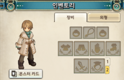
Also the equipped items section looks clean and nice with that division, I just think that, again, it is too plain… it could have something else to decorate that section maybe.

All in all, the change is indeed very good, but they could have polished it better imo :confused:

EDIT: Wait - where is the weapon set? Those 2 slots to alt+z weapons?

When we’re going to have those neat token changes…

That radio-looking thing under the weight value looks ugly and unnecessary. They could remove that big TP icon from the screen and put it on the inventory UI. Maybe like this?

image

1 Like

You mean, they should add radiostations for that thing to play, right? :'D

hey guys, does anyone know where is the new HG? Thanks!

edit: quick other question, does those +25% evasion means increased evasion based on how much you currently have, or an extra 25% flat evasion chance? Same for block

It’s at the lower part of Mochia Forest

1 Like

Hi, may I ask where can I see the R8 C3 Attributes?