nomonster regeneration rate update on kTos yet? means what, is there a bee nerf or not? more fake news?
it could be that is only on kTest and not on oficial server yet, the new drop system and optimization is still part of kTest but not KToS as far as im aware
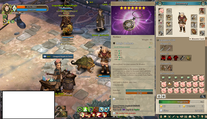
ive had this for half a year now, took me 3 months to make. you have one too? i think ive seen only one other person with one
oh my, you have balls.
It gives more magic res than max peta!
Max terraillon should be stronger than this goddess necklace
Took me 3 weeks, with less sleep and nothing to do, which also makes me want to quit …but since I already did halfway …force myself to continue.
Seems like ktos has no patch update nor maintenance this week
refer here:
Hello Friends,
kTEST has been updated once again, I’ve supplied the patch notes in the next sentence.
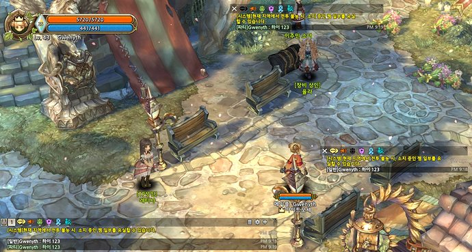
In summary, changes related to trading, the chat ui has been modified slightly once again and the fedimian daily npc has been altered to make it seem more appealing to users, as well as bug fixes being applied to classes.
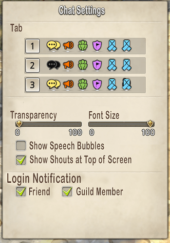
The new chat config is also handy. There’s another window you can open too to have a list of group chats/friends/whisper ( forgot to take picture of it sorry). You can also resize & lock the chat window sizes now.
You can have 2 extra chat logs open and can be placed almost anywhere on screen & resized, except they cant be put near the lower section near the skill bars, by selecting the chat type icons you can filter out other text you don’t want to see. ( top chat filtered out general, one in middle filters out party messages) , wouldn’t mind one to hide system messages though. The padlock locks resizing of all your chat windows, but they can still be relocated ( not sure if intended?)
Item tooltips have now also been updated. You can now clearly see what you are able to do with items as their ‘tradability’ and various categories can be seen in the window below.
‘Shop NPCs, Market, Team Transfer, Player Trading’ are the specified methods you will be able to see what you can do with items, if a section is greyed out - it indicates the item cannot be traded in that specific type of transaction. (In this case, i can do everything with my large rice cake 
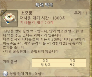
Another thing i forgot to mention was that with some item descriptions that were considerably long, they have been cut out of the item description upon hovering - however they can be viewed in detail by pressing shift whilst the hover-window is still active. Well, i could go on but long posts are scary sometimes.
What are your thoughts to these current changes on the test server?
Thanks for the notes Gwenyth.
Inquisitor:
Pear of Anguish:
- Fixed issue when attacking the Pears of Anguish they would sometimes take damage multiple times.
The end of Boss nuke inqui?
Or this is another issue.
Yes.
Good. Even as an inqui that ■■■■ was broken, lol.
That’s an interesting update, UI wise …lol
Also I didn’t realized that there’s an update lol
Man …the test server’s update really is at random date and random time
■■■■■■■ x100 hit caltrop mode of pear of anguish is op as ■■■■ vs bosses
Any chance to get back the rank reset?
Maybe for Appraiser release… but if Appraiser is already available in KToS and they didn’t offer a rank reset yet, I doubt we will have a rank reset soon in IToS. Maybe when they will release rank 9  .
.
I need to know… was it worth it?
bit by bit the base game becomes something resembling decent.
Within 2 years the game should be playable.
3 years for Itos.
Good UI and QoL changes.
Personally I would have the tradable status listed in a row instead of a 2x2 table though. As there will be times where an item with multiples have a mix of tradable and untradable status, displaying them side by side with the statuses makes more sense in UI.
Extra chat windows are really great. Do they have a shortcut key to make typing in between the chats easier? Like shift+tab to switch between chat panels?
After nearing a year of release. The only UI change I’m waiting for is: Show multiple companion’s stat in F9. Since time immemorial to check on our air companion’s stat when accompanied by a ground companion aswell we’ve had to: Go to lodge -> unequip the ground companion -> log back in.
Truly amazing UI design, Class Design and QoL for your players.
How come you guys know that Appraiser video is mine? 
Anyway, sorry for the late reply.
I have spent some time gathering questions I got so far regarding Appraiser and doing tests. I made another video answering all of your questions. Please go check it up~
If you have any further questions, please feel free to ask me again.
Wtf? Hunting ground unidentified equipment is DPK?
Are u surprised?
/202020
