The new homepage is more clean and objective. I can see whatever i want of information.Good Job!
[SA]SILUTE
Polkk
The new homepage is more clean and objective. I can see whatever i want of information.Good Job!
[SA]SILUTE
Polkk
Just gonna put a lot more details
The website is improved greatly now, good!
except the part where:
background theme - its too bright
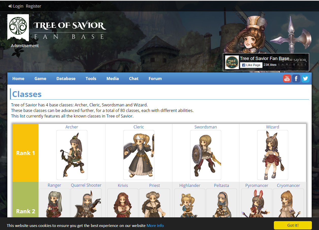
in class page
better just use “Classes” instead of “Classes list” or Class list …but classes fits better I guess.
skills is too crowded
would be better if you guys make vertical list of the skills separating the attribute with lines
if possible, add button which will prompt animation of the skills as well
seems like attribute’s rank info aren’t correct
rank up tab
- when ranking up the same class, only 1 skill is shown (new skill right?), but it just doesn't seem right, better just put all skills together with the new one **OR** put a side penal with skills, and the skill will adds up (like how kr tos site made it)
class ranking
text seems a bit too cramped, better fix the gap between the lines or something
is it possible to put a toggle option to make front page “article” both in list view and icon view
(current one is icon view)
others is good enough I guess…
I really liked it, the site is much more dynamic and easier to find information and visually pleasing
Team: RecDec
Server: Silute SA
The info isn’t even correct. Cleric e.g. lists Plate Mastery:Defence attribute as Circle 2 attribute and Cure:Damage Interval as Circle 3 attribute. The Circle 3 attributes for Guardian Saint are nowhere to be found, same with all attributes for Heal, Deprotected Zone,etc.
I don’t really understand why they already put in the info if they have to adjust it next week with the changes anyway?
@STAFF_Yuri
Feedback for the website. The website looks gruesomely disorganized. I’m sorry for growing up prior to the lost generation [I’m still younger than 30 though] aka smartphone generation which thinks everything has to be listed/shown in colorful boxes with pictures on them.
As a person studying a scientific subject, I believe the predecessor was doing a better job for informing people (though it might’ve been a pain to use in a mobile phone but who cares; phones are made for calling, not for surfing&gaming) without distracting pictures and text on a white background, which makes it harder to read/browse through the information.
How about making a compromise with keeping the current main page but reverting the tab pages (i.e. developer’s blog, announcement, patch note, known issues, event) in the old list form without any pictures and the blue background+ white font?
Would sure help to browse faster through everything and find what you’re looking for.
And btw, a tip from me:
Disable the “most viewed” option on the mainpage. The posts with the most views are all a year old and thus neither up-to-date nor advertising the game as it creates the impression that the game is dieing (it’s the truth but you don’t have to advertise it so openly xD)…
I would change the white background and add back the server status on the main page.
I’m sure they did that just to show preview of how the class thingy will look like
until they fix it later. …At least hopefully.
Jesus, IMC did a nice job on the website, but it seems they totally forgot the basic notions of HCI with this white bg. I’m done with forums until thay change this
I think the website is way more beautiful, but I can’t say that is easy to navigate or “organized”, principally the Forum part.
Team Name: Elendian
Server: [SA] Silute
I see only now that server status on main page disappeared, for me it was helpful to know when server are under emergency maintenance.
Edit: ok now I find the notice where server are in maintenance
The main page says that My server is under maintenance (Fedimian),
but I’m online 
maybe there is a error with the maintenance warning on the main page?
Too much white.
This one uses white too, but is much better to see and dont hurt the eyes. Why? Because colors.
Already stated on Facebook, but if you guys change the background color to white, you change the font color to black or a dark color. I’m reading what im typing on grey not black, and that’s fcking annoying on a white background.
The Class section is too tight. Separate and divide more the 4 basic classes columns, they are too close. Some attributes are missing in the class info page. Either put a “Most important attributes” titles or put the rest. Besides those and some others issues, the homepage is good and attractive.
Brightness is hurting my eyes, even the words is kind of faded. please some Tree Of Dark, We can’t handle Tree of Light. My eyes is bleeding
The new website looks so great! It’s easier than before to navigate, everything seems organized and clean. My eyes feel pleased with that white background though! I loved it!
I think that the site it’s great. It’s more simple to use now. The only thing that i would like to see it’s a part of the site with the fan arts, especially the ones that appear in game. Maybe you could make a selection of the best Tree of Savior arts and put that on the site, on a individual part. It would make people send more arts and you could even make competitions for what art would appear in game.
South America - Silute
Aekyn
3hard 3read 4 me m9
10bright !!
also, pls give us the option to check every server’s status
team name: fleuquor
server: [na] klaipeda
It looks good, but where is the server status?
I do not see it
Team:Gochopower
Server: SA Silute
Old one was better. Imho lol.
MobileUserHere*
Well… The homepage is better than it used to be, so much simpler to use and visually appealing.
About the forum - Well, the old visual was better.
Kyrohad - SA Silute