Tree of Savior Forum

[Updated] Let us discuss about our new homepage!

I like the new minimalistic concept that you guys put on the site. However, the color scheme could use some tweaks though ( It’s too bright? The background is white and the sub buttons are in a greyish tone ).

This is just a personal taste, so feel free to ignore this one. Line height could use some fix as well. It’s too crumpled.

Team Name: Vestinel
Server: Varena

The old homepage is better but this new is good too
Team Name:Algandar - SA Silute

I love how clean the new website is. The white bg color gives me a positive mood unlike the old one which is dull for me.

Team Name: Ga-Suki
Server: Varena

The white BG, specially visible on forums, is bothersome.

@STAFF_Yuri

Here are my comments for the homepage.

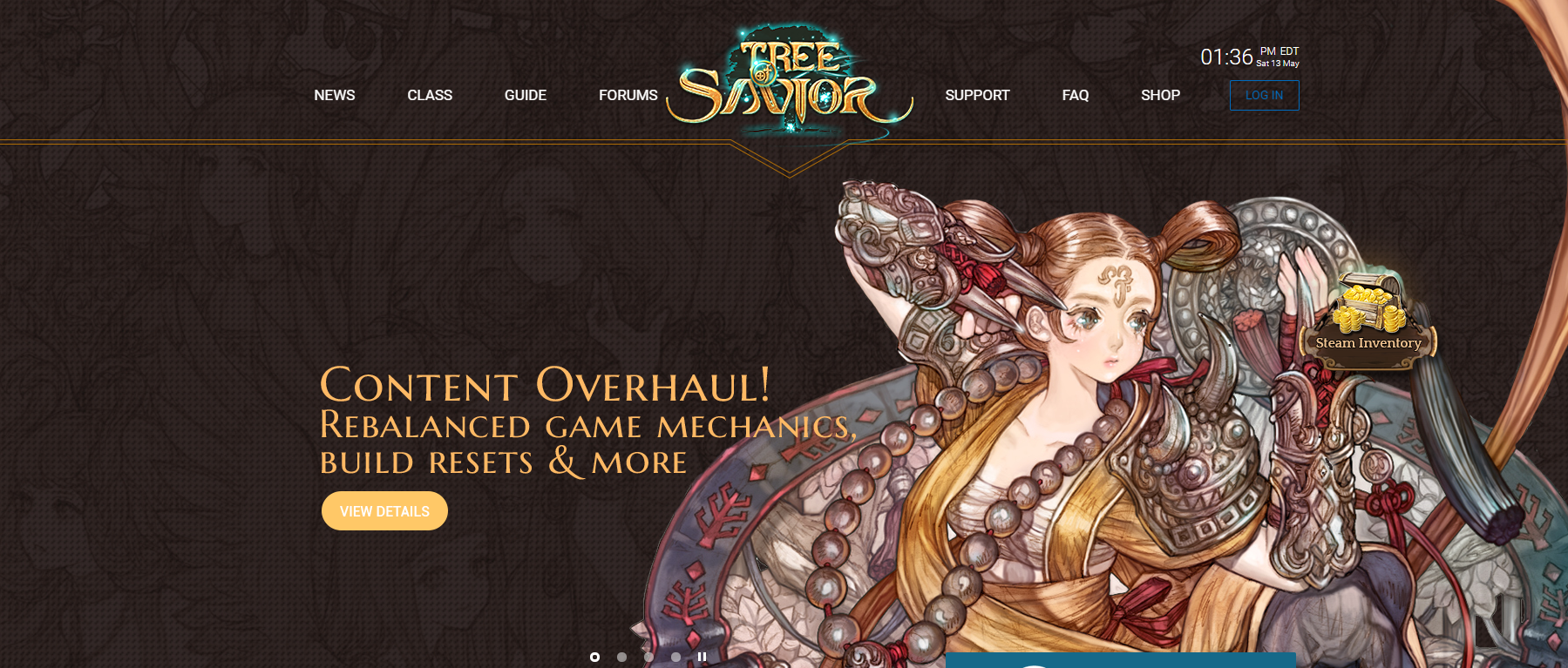
Header design and layout

It will be really great if can lose or change the orange lines that divide header and the hero/masthead image. If want to keep the lines, giving ample space for the logo to breathe will be great.

A suggestion for this type of floating navigation design, in order to make the navigation elements distinct, one of the tricks in which designers employ is to have a vertical linear gradient from black (with opacity around 0.4) to transparent for the top of the site. This will make the white navigation text more legible and allows different kind of hero images to be employed on the masthead.

Eg. See how the linear gradient works to bring contrast to the white navigation.

Next is the login button. The blue color used is great for a few masthead images but will have problems in future when mastheads of different background colors are used. A suggestion is to change it to a more neutral color (such as white) so that it will contrast itself well with most of the background colors for the different mastheads.

Careful for the floating element

These days it aren’t easy to be a web designer/web dev since we have to make sure that the website looks really good on all sorts of screens and resolutions. As such we need to be really careful about floating elements such as the “Steam Inventory”.

In screen resolutions like 1280 (which is quite common for smaller laptops) the button overlaps some part of the masthead content, especially those with content which are right aligned. A suggestion is to bring it down to the same level as the steam play game button. It can be of the same design as the play game button too to keep the design consistent.

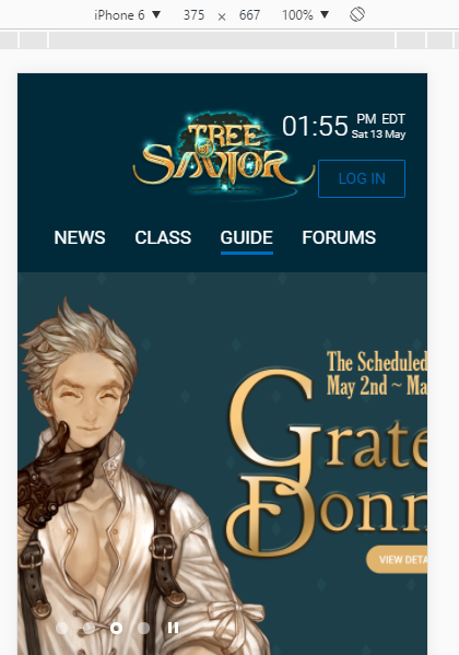
Homepage isn’t fully mobile friendly, still a WIP perhaps.

Content for Homepage

Currently from what I see is there is a news section which shows the latest 3 news which is really great. Without a header telling what the other section is about it is hard to know what the content is talking about. Only players who are well read into the lore of ToS will realise that it is an article on the Falconer master.

Homepages should take on the role of bringing its users in to the rest of the pages, so the call to action buttons on homepages need to portray that.

There are a few great sections in which I would suggest to be placed on the home page, they can be short excerpts in which are created to make the user click the “read more” button to find out more.

  • Short video background of classes play-through in game with a “Learn more about classes” button
  • Images of the game world with a “Learn more about lore and ToS’s world” button
  • Small section on server status and patch updates.

That’s all for the homepage. :3

2 Likes

The only problem for me is having to read all the text in this full WHITE background. It is just tiring. There are topics that we have to read every single comment to understand what is happening (Ktos thread for example) and I can’t stand for too long reading those texts in white bg.

take something that works and break it… well at least you are consistent. Get rid of the white background!

@STAFF_Yuri the Class section is both outdated and unbalanced,skills on the wrong place, attributes not there, no hidden classes, no relevant information at all…

to put it terms anyone can understand…

The Class section is like having the meal you always wanted, but when you sit to eat, you realize the chef only used 1/3 of the ingredients and half of it is raw or burn…

too bright!! xD teamname : elvyr server: telsiai

Not sure whether it’s better or worse… but personally I think it can be better and the white color is hurting my eyes and also the gameplay experience should be paramount eg. ping issues…

TEAM NAME: LexTalionis
SERVER: Telsiai

I like it very much, the interface is good and it’s easy to use. For me this is what matters most.

Team name: Gathios
Server: Silute

I’m ok with the overall visual of the website, but it realy is a bit too bright. I think it’s great, though, that you guys are always concerned about the opinion of the players to improve the quality of the and the services in general.
Congrats to you all. =D

Team Name: Halstead
Server: [SA] Silute

Too bright.

Anything brighter than my future hurts my eyes, but the interface is good.

it is kinda bright would be nice to add some grey or so. But looks cool

Team Name: lMushil
Server: Klapedia

what addon is that? :smiley:

The one I use is called Color That Site

not perfect, but it’s easy to use (at least for me)

Things I would improve:

  • The slide show on the start page is a nice element, however the dots on the bottom are way too small. Suggestion: Either increase the clickable area around it or the dots itself. Another option would be exchanging them with arrows on the sides as you dont know what slide picture will be in the next position anyway
  • On the news page, there is a search input field. This one shows a type cursor instantly. But you can’t actually type unless you click on the field.Suggestion: So either hide the cursor or (better option:) set the focus inside of the search input immediately
  • Guide looks like a huuuge section, but if you click it, you’ll be disappointed: it looks like there are only 7 guides. This is cause be the secondary color used as links for the guide titles. Suggestion: Make the guide titles (e.g. Create a Team/Character, UI and Basic Info) more visible by using your typical link color (blue in this case).
  • In the Shop, when I click on ETC, there’s a huge popup coming up. Actually I thought it was a real error or something first. Suggestion: Don’t use a huge popup for this. Just display the message where the items would be.
  • Why do I have to log in for the website and the forum separately when they just use the same tab and credentials? I know it must be some technical restriction, but still I always think that I still have to log in when I go to the website with the intention to use the forum.

Besides these points (which is just me nit-picking): I think your webdesigners did a great job! It looks quite nice and clean and this is the most important part!

1 Like

Very good :3
Team Name : NobleGuard Server:Silute SA

Very good :3
Team Name : NobleGuard Server:Silute SA