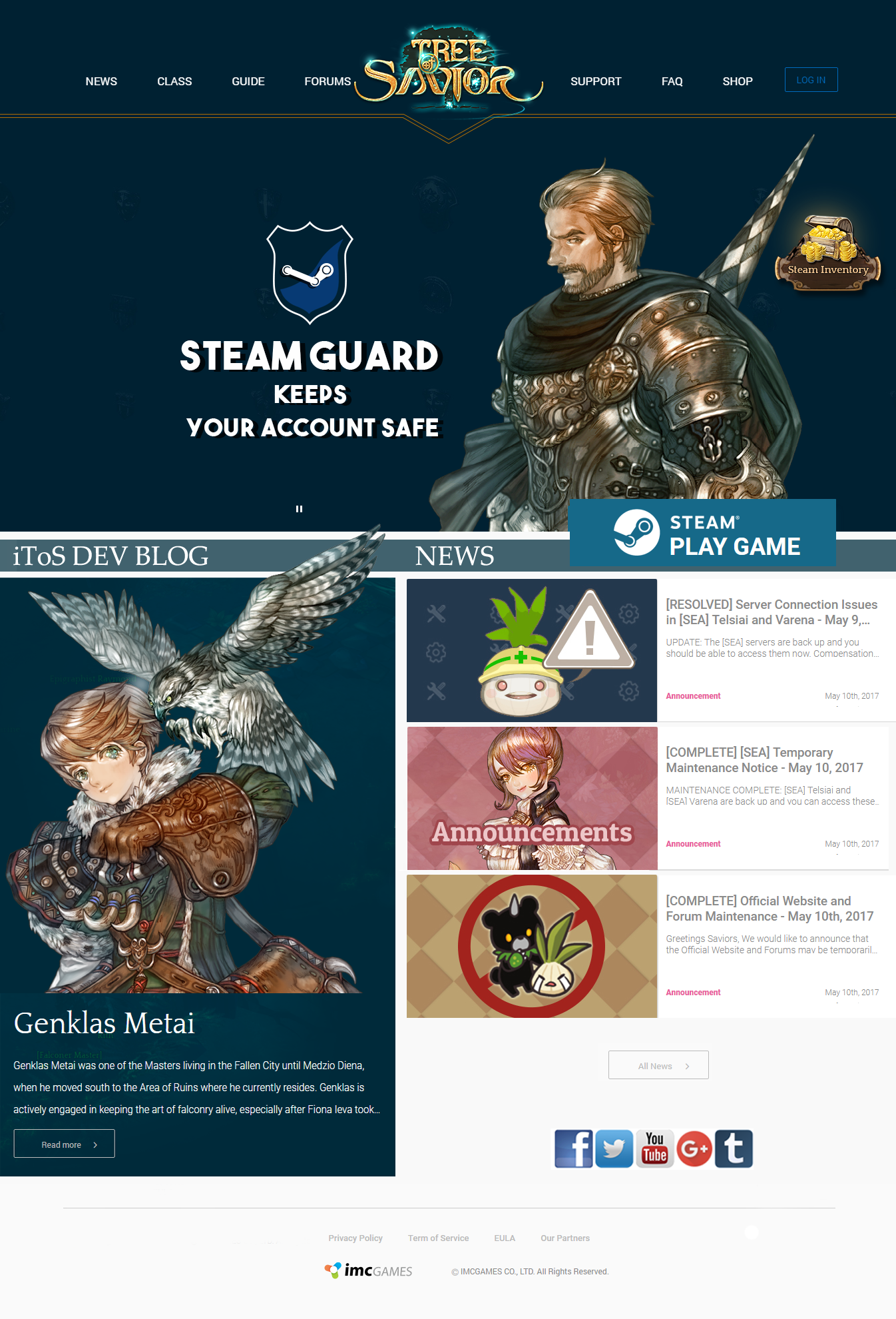
The website itself looks nice and stylish. Especially big icons for each and every news.
But (!) new forum design is just terrible. Colour balance is bad and the white section is just to bright. That’s immense pressure on the eyes. I think you should reconsider this bleach white colour scheme and make it more friendly to the eyesight.
Also forum pages look torn apart due of the lack of solid colour scheme - now it’s a mashup without any balance or pattern. Sign of a bad taste imho.
Forum is just unreadable now