Hi.
I’m a player of ragnarok online, because It makes me feel in another world. An older .
But I think that the excess of colours in tree of savior doesnt help at all.
Excess of saturation makes me feel in 2030…
I think that we need one review of design, in special attencion with ground…
Put purples, reds, green with less saturation… (to people feel like in medieval world)
It should be amazing…
What do you think about It guys?
Not to be rude, as rude as I’m going to sound because there’s no other way to put it.
This isn’t 2002.
1 Like
U could also do it urself, by lowering the colour correction/vibrance/saturation lvls of ur monitor screen…
3 Likes
no… Its maybe 1100 A.C…
its different. I’m used to play a lot of mmo’s nd they even decide: or choose cute (like a cake), or
The art style is great, and ToS world isn’t a medieval world… Nor even the colors would turn it in one.
It’s the very first time I see someone complaining about colors. So maybe it’s just you…
ToS forum math: A suggestion + Dat word = More problems

The lowering the monitor color depth was smart tho’, never even considered that. Smart Gun.
3 Likes
The colours of tos seem pretty dark to me. I like them though. RO is much brighter and colourful, I don’t get why you feel this way.
1 Like
i think that ToS is dark. But i’m not refer the bright light… I think that It could be more bright too…
But my point is the saturation of colours…
Its like to put pink in salmon-pink…
Or dark green in less
I don’t think it look good with removed saturate.
It’s a fairy tale
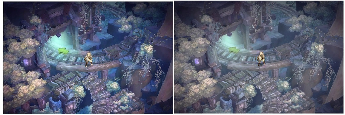
I think that it looks worse than the original colors.
Uhhmm… Maybe we can just do…
No wait… Nope… Just NO
1 Like

1 Like
This… this must be the work of an enemy alt!
That means that the main account must be nearby!
This post was flagged by the community and is temporarily hidden.
2 Likes
that’s the point… We are creating a piece of us…
and sometimes i think about the excess of colours and low light of this game…
but the design is pretty (at all)…