It’s much more stable than before
@Flash
Not a big bug, but it can be confusing for begginers (one of my friend just confirmed this) :
The font of few classes is different from other classes for no reason.
For instance, in this screenshot, Monk and Sadhu have different fonts.

I think this is because Monk, Pardoner, Druid and Oracle were added in the 2nd CBT and the others were created for the first CBT. I’m going to recreate all those images and will make sure that all text look the same 
1 Like
When you do that, can you confirm tge spelling of Sadhu? I’ve seen Sadbu and Sadhu, not sure which is right.
Yes, I’ll also remove spelling errors. This was actually how the name was written when the Nexon page was opened (before it got fixed) so unfortunately I used incorrect information as basis for it because it was “official” ^^.
1 Like
We added an Element Page to our website. This element page includes an element table and useful link to elemental skills and monsters. We hope this page helps new players to get a good overview. Of course it can alse be quite handy for experienced players 
BTW: Recently there were no updates like this on TOSBase. This was because I was focussing on few bigger updates like the Skill Simulator. I’m now trying to focus more on smaller updates for some time. In the future I’ll try to find a good balance between small updates and big features.
2 Likes
Perhaps finding people to help manage it would do just as well.
Nice to see the currently-most-worthwhile db still doing well.
(not that I agree with not just using wikia and gathering together all the people doing other dbs…)
Thanks
A few month ago when 2 other databases were created I contacted both and offered them to join our team to work together on a database but both refused.
I’m not a big fan of Wikia because the way it’s build, the ads etc. I created TOSBase and the TOSBase Wiki back in November 2013 and invited people to work on it several times but it’s seems most people rather create their own projects instead of joining existing ones.
For a database I think it’s way easier to maintain as a website because it’s way easier to import new content into a database instead of updating hundreds of wiki pages manually.
I agree that’s quite a shame that work is done multiple times by several people but I guess it’s the same for all games. I saw the same happening in other games before atleast. I think we are on a good way and Gardosen and me are capable of adding new features, so everything is fine for us
Finally we have good information about the elements. Some of my friends and myself were wondering how the element system will be and this will absolutely help us. Btw it’s interesting that we have poison as an independent element (I usually found poison in dark or earth abilities)
Woo! I hope you guys get a lot of info from the next beta! so we can get into the really juicy stuff 
Well, since there’s no reason not to, here’s some simple(?) stuff the site could use.
Things I look forward to seeing
- Explanations for basic mechanics
- Some more information on hidden classes. (even when there’s none, a short explanation and stuff)
- The possible hairstyle types for both gender. (‘how’ is not so big a deal, much more curious about ‘what’)
- Some clean-up/rework of the design. I find the amount of scrolling for many pages quite off-putting.
It’ll help if at any one time, the information I want to look at is well-organized and compact.
i.e. if I want to look at class skills, all class skills are visible and easy to overview.
i.e. if I want to look at class advancement, all the instructions can fit into 1-2 pages. - Competitive nature.
(with this many DB, this is a battle, even if you don’t take it as such. SURVIVAL OF THE POPULAR)
I’d say
Treat your readers as though they were 5. The goal is to supply clean, compact, easily accessible information with as much detail as possible without being confusing while properly explaining the relationships between all concepts. (of course it’ll be nice if it’s neat to look at, too)
Well, that’s what I think a wiki should be, anyway.
or not.
Well honestly, I think the ToSBase design is bad currently. It takes time to find something, you need multiple page loading before getting the requested information. (for instance, if I need to find the crossbows sorted by level, it needs 4 pages loading from the home page…)
Furthermore, as LaScoot said, the database information display isn’t compact and hard to read ; Please keep each entry on only one line! It also lacks of custom search options.
Don’t get me wrong, I think this website has awesome tools, data, community, but it’s very clear to me that the webmaster never designed a database website before, the data isn’t exploited and renderered correctly, it doesn’t feel professional.
http://tosdatabase.net/ is a lot more intuitive regarding the website design (even if it’s still rudimentary), you should take note
Hello LaScoot,
first of all thank you for the critic. we are always willed to get in touch with the people who like our project and want that we are going to improve it.
-
we are working on guides for the mechanics, but this needs access to the game, it’s on our todo list as soon as we get again access to a cbt or obt.
-
the hairstyle presentation was already done by flash in a news entry
http://www.tosbase.com/news/107/Character-Creation-and-Hair-Styles/
never the less, i agree with you that we could add this as a entry in the page. -
design: as we already said multiple times, we are not designer. Flash is a great programmer with experience in C++,C,php and so on, but not a designer.
same goes for me, i am a programmer developer with a master degree in artificial intelligence and network security i have no clue about design. XD
sadly even when we are searching permanently for someone who wants to join our team for design related stuff, we always get a rejection -
Flash and me doesn’t care for competition. we are doing this project because we love the game. we love to code and we love to provide information to people who love the same game. we approved already several times that our work is reliable and we doesn’t disappear. the best proof for this is www.roguard.net we created this web site 2008 as a database for Rangnarok Online 2 Legend of the Second, and it’s still online and available for the people. (probably a bit outdated as we have the full focus on tos right now.
so the answer to the question of competition is: we don’t give a ■■■■
people appreciate what we are doing, they like our tools, and based on the feedback we always try to improve the design and tools. this is our passion and this is what we want to do and what we will always do. -
a wiki and a database is something completely different, and we are not a wiki, we are providing tools and a database. our personal hope is that imcgames by themselves will provide a solid ad-free wiki for tos where people can contribute to.
@Memento:
yes you said it multiple times, but saying the tosdatabase website design is more intuitive is very subjective. rate my server has a intuitive design, for me tosdatabase looks clean, but not intuitive.
and just to say it again: if someone wants to support us on the design of tosbase.com you are welcome 
Kind regards
Gardosen
I say design as in the organisation.
The toolboxes with a lot of empty space, images spreading a page out too much.
Having to scroll 2-3 pages just to see the skills of a class and the like.
I failed to clarify myself properly. I define both wiki and db as a service to provide information.
Eitherway, not my place to tell people what to do when they don’t work for/with me.
Supporting the design
Our policies line up poorly.
1 Like
Just to clarify this a little bit more.
we don’t care for “Competitive nature” because we are not doing this to get something (money, fame, what ever).
if the others wants to battle, who’s the best, they can do this, we will not join this attention train.
the project exists because we like Tree of Savior.
The tools are existing because of two reasons:
- we want to educate our self and improve our knowledge in coding in many areas
- we want to support the community with some handy calculators and simulators. if nobody wants to use them, we are fine with it, because then at least we fulfilled reason 1.
there is no reason for us of Competitive nature.
Kind regards
Gardosen
1 Like
I agree about making things easier to reach like the Crowssbows.
But there is no correct way how the database information is displayed. Actually I think about 90% (not based on valid information) of the RO fans (and that’s the majority of TOS fans) prefer a RMS like design with all important information shown on the overview page. I used the one-line style on www.roguard.net (RO2 DB) and on TOSBase. Some weeks / month ago all our database content was like that but people contacted me and said they wanted it to be more like on RMS because they think it’s better to get an overview about items / monsters and don’t want to click on all of them first. Since I changed it you are actually the first to suggest switching back to the one-line style.
So whatever I use, there will always people that think it’s completely wrong that way. Maybe I should add a compact view mode that will display all databases one-line, so everyone can decide what they want to use?
About search options: Yes it’s definetly not possible to look for every little detail at the moment but I think we covered the most important searching option and have the most customizeable search but if you think something importan is missing just tell me
Excellent ToS database. Extremely user-friendly, clean as a whistle, easy to navigate, and easy on the eyes (dark background = better for my eyes).
Thank you!
Thanks for your detailed answer.
I don’t know who is your target audience, but I wouldn’t listen to people who want to make RMS 2.
RMS design sucks, there is really nothing good. Seriously, I can tell this website is 10 years old only by looking the home page : fixed width div with menus taking half of the page on both sides of the screen (unreadable on mobile), links and menus everywhere on the home page, poor colorscheme, ugly header that takes half of the top screen, also “ratemyserver” is really a dumb name for a database focused website, whatever was its first purpose.
We’ve made so much progress in UXD, use this knowledge. Don’t display full information about items, a database purpose is not to retrieve full information about everything, but to compare and sort results with eachother ; one-line the data requested, and display the full description on mouse hover on an item.
I guess many people want it because it’s what they know and what they’ve grown up with. So it’s pretty normal that they prefer it even if it’s maybe not the best way to display the information if you look at it from a neutral point of view.
I guess the best is to offer both (it’s not like that is much more work when you already ave all the information) and that’s what I’m currently working on for the ItemDB.
On ROGuard I refused to use a design with all information and when a new database came up that used it many people started using that one and were like “See, I told you that’s how a database is supposed to be” and I gave in, so I think there really is a demand for this
About the general webiste desisgn:
We’re also working on a mobile design that is supposed to be used for mobile users. We might switch to a full responsive overall design in the future though.
1 Like
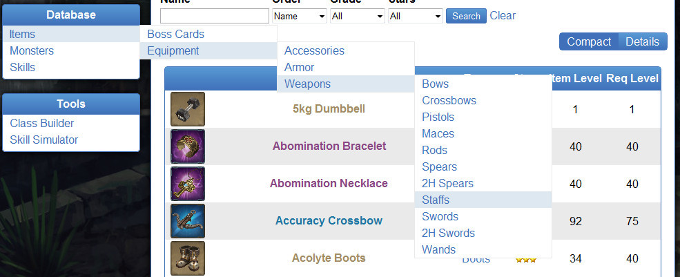
Ok here is the new version with Compact and Details View. We also added sub elements to our side navigation so you can reach the content faster.

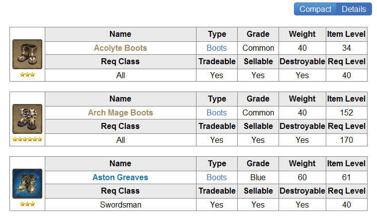
I hope that makes it better useable for those of you who don’t like the detailed version 
If you like it we will use this system for all out database pages in the future. We’ll also try to add other suggestions that were and will be posted on this topic 
2 Likes