Tree of Savior Forum

Stylish Dark Theme for the new forum/site

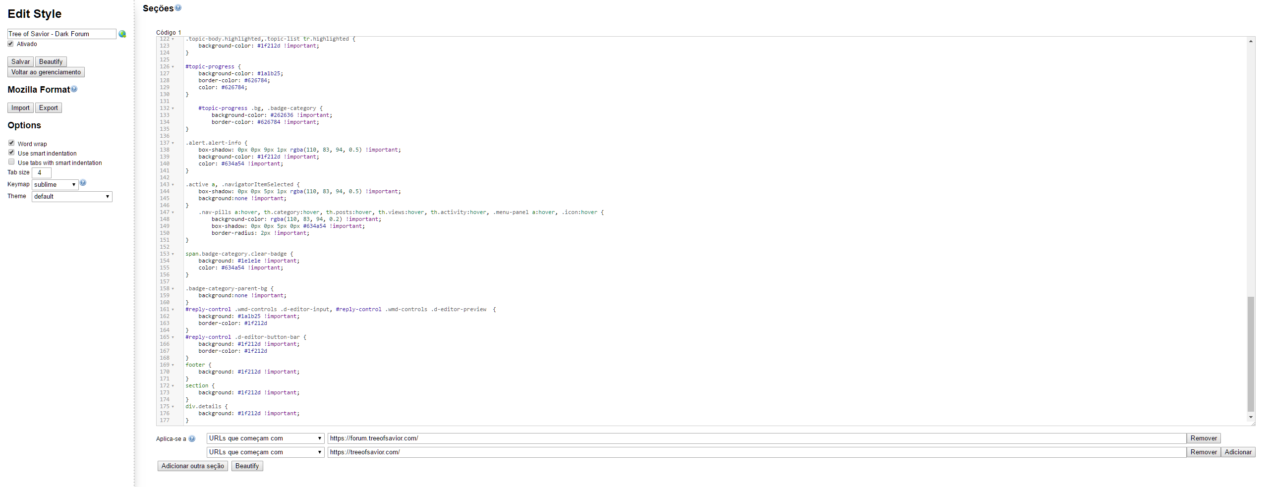
I got the https://userstyles.org/styles/120174/tree-of-savior-dark-forum by 「 l i i m a 」 and added new lines to complete the actual missing parts.

Note: You need to install Stylish Extension to your browser to be able to use this.

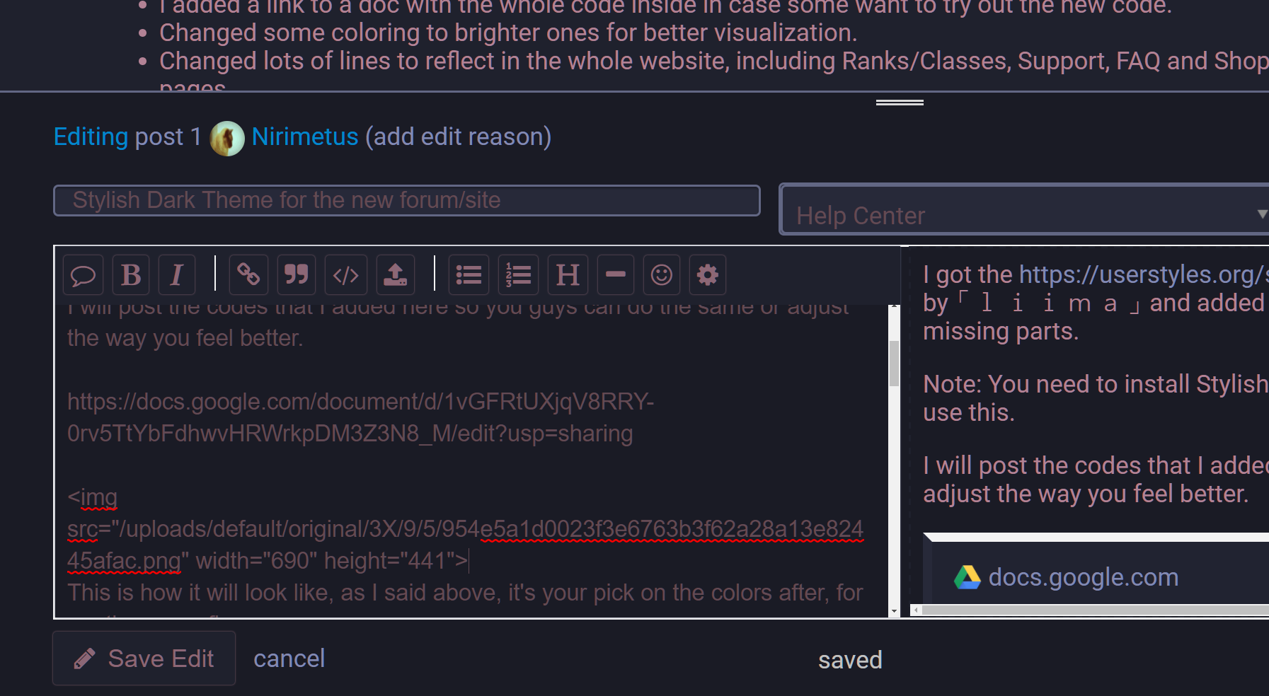
I will post the codes that I added here so you guys can do the same or adjust the way you feel better.

#Screen shots:

Rank and Class Pages
Forum Pages
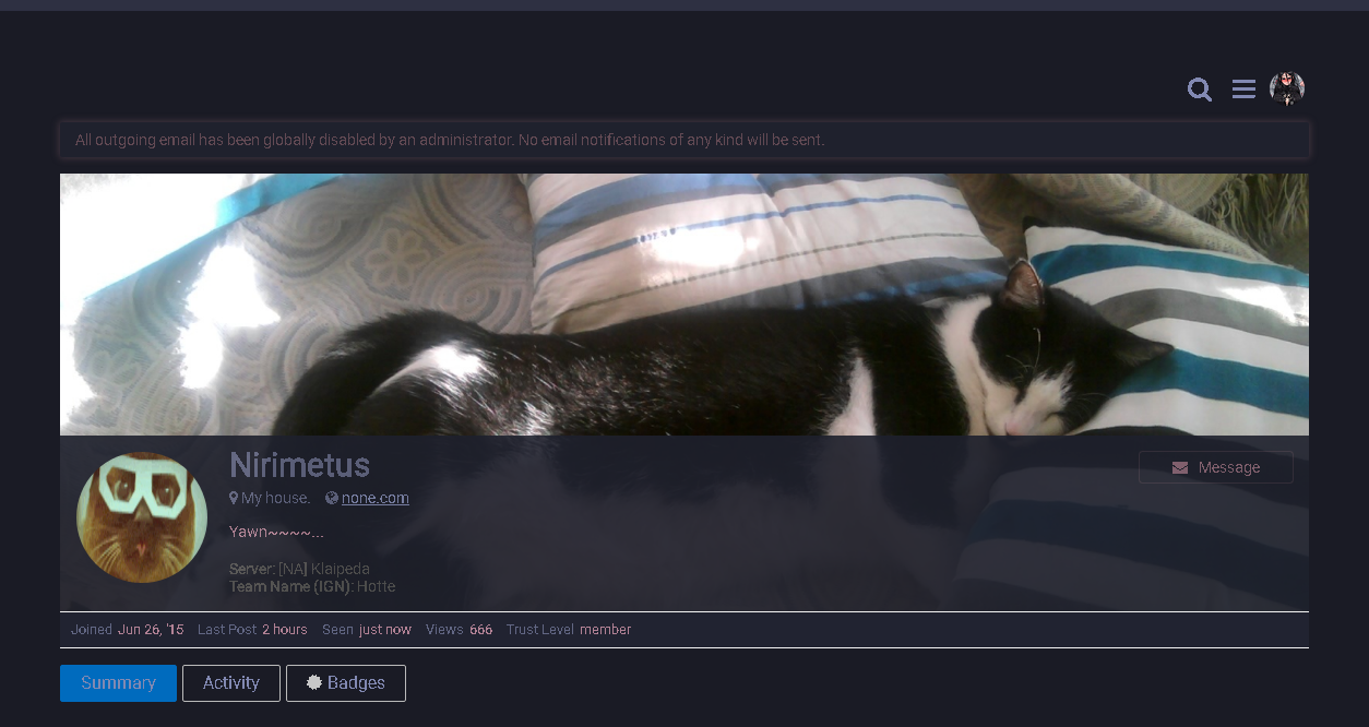
This is how it will look like, as I said above, it's your pick on the colors after, for me these are fine.

I will add a small guide on how to make the edition of the scripts:

Guide1. After installing the Style above, left click on Stylish button on your browser (I'm using Chrome, not sure if it's different icon color on other browsers) .
  1. Hover your mouse cursor on top of the style and press Edit:

3a. On the new tab (Stylish Editor) scroll down to “/* Below is the new lines added by Nirimetus*/”, press enter once and past the code from the doc above in it and click save, it should take effect right away, if not, just refresh the page:

3b. Since I reworked the colors in the old code, this step is only in case you want to get the new one working: Instead of just add lines at the end, you will remove the whole code from the old one in the editor and past the new one from the doc above in place and save it.

That is it, you can see in the code the color codding, there are some online CSS editors out there you can use as a guide for color codes and change to the ones you want.


#Change logs:
-05-15-2017

  • Added new lines to background color for Patch Notes sub-titles and respective text boxes.

-05-12-2017

  • Added codes for News Right Block (the one with links for other News).

-05-11-2017

  • Fixed minor code alignment (nothing serious just for organization).
  • Changed Footer color to match the Header (top of the page where the menu and game logo are).
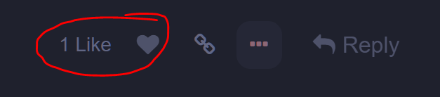
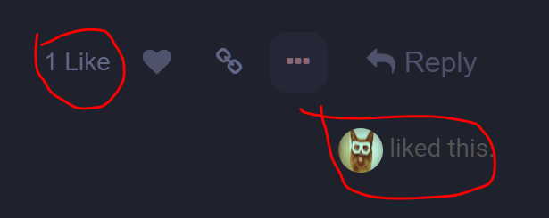
  • Added color to Like button highlight including the Like text (thanks for pointing out @Imouto ).
  • Added style for Badges Blocks.
  • Added new code for profile cards(?) (thanks @Imouto).
  • Added opacity in the half bottom part of background image profile (thanks @Imouto).
  • Fixed background image in profile being hidden by body color.
  • Changed text color for Categories.
  • Changed Alert color and Shadow effect for a more bright one (it was too dark).
  • Added coloring to uploaded images labels (that text you see when you hover on top of an image in the post).
  • Screen shots and guide are now under Spoiler Tag to decrease the length of the post and keep it a bit cleaner.
  • Added some screen shots.
  • Minor additions and fixes in the guide.
  • I added a link to a doc with the whole code inside in case some want to try out the new code.
  • Changed some coloring to brighter ones for better visualization.
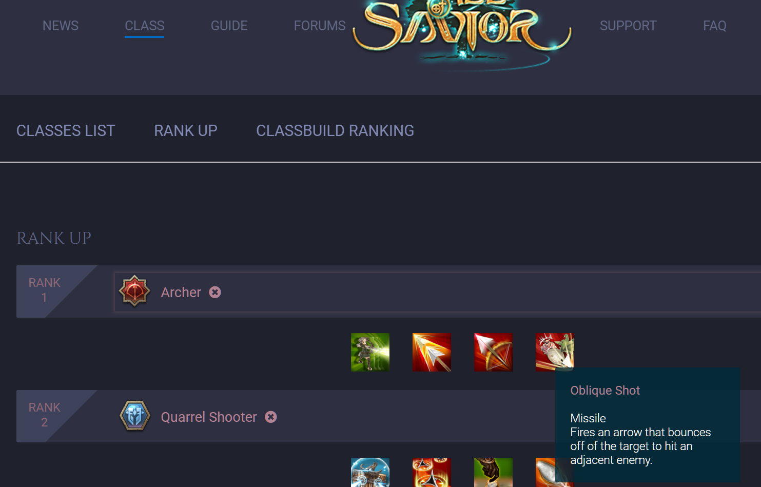
  • Changed lots of lines to reflect in the whole website, including Ranks/Classes, Support, FAQ and Shop pages.
  • Added new lines for Upload floating window (no more blinding white yay!).

-05/10/2017

  • Added new code for div#header_wrap (ToS logo and menus background) to new color scheme.
  • Added new codding for lacking parts of the old code.
18 Likes

let me say that you are a real hero here :thumbsup:

2 Likes

Might I suggest a few things?
Delete:

section {
background: #1f212d !important;
}

and add opacity to

div.details {
background: #1f212d !important;

to make it

div.details {
background: #1f212d !important;
opacity: .9;

Before.

After.

4 Likes

and if not wanted as a general layout for everything, why not addings this as an layout option for us?

i like it and i think others do too =D

I’m trying to find the value for the background image on profile, if I remove the section, the main page will be white again, as soon as I find it I will fix it.

You mean IMC web designers adding this as theme on the forums? They might come with some nasty coloring soon lol.

2 Likes

why not. i mean the white theme is okay. but after some time it s getting somewhat hard to focus on =O

I used the dark theme to build this dark blue theme if someone is interested https://userstyles.org/styles/142495/tree-of-savior-forum-dark-blue

I hope I didnt miss anything

1 Like

God I’m dumb, it was so easy LOL, just had to remove the !important part and it’s working.

2 Likes

div.card-content {
background: #1f212d !important;
opacity: .9;
}

For when clicking the users card or whatever.

3 Likes

button.widget-button.toggle-like.has-like.fade-out.no-text {
color: #FA6C8D !important;
}

For like button.

No clue what color to get so I just took the original pink.

2 Likes

By like you mean this one?

1 Like

Wait. It might have changed more than I though.
Never mind. I’m going crazy looking at these codes.

Yes.

3 Likes

Well not sure if others would like it, so they can change at their own leisure, I left as it is because when I hover the mouse over it it change to the pink color to highlight.

2 Likes

Ah. Makes sense.

It was just a little weird to know which posts I liked and which I didn’t since they were all the same color.

3 Likes

Ah I got what you meant.
Indeed is not highlighting when you like someone’s post like it does in the default theme.

I will take a look into it.

2 Likes

I added the code for the Heart icon, I can’t find how to control the text in the side tho, I will try to look a bit more into it, if I can’t figure out then I will leave as it is.

Never mind I found it and will change now.

I just noticed that it change to all the instances, I will have to take look into it again lol. What a pain in the ass this thing.

I will have to leave it for today, for some reason I can’t like/dislike anymore, be it with or without the theme, the function simple doesn’t work.

After messing around with that part, I found out that there is no code controlling who liked specifically, so I will leave it with highlight, at least is an indicator.

2 Likes

OMG I hated this all-white forum. Can’t read properly.

I’ll download your theme. Thanks.

Edit: Much Better now.

1 Like

Brief little complaint before I actually start working on my own…
Your default text is a 2.1 contrast ratio.

Seriously, aim for at least a 2.5, if not a 3.5. 7-9 is preferred, but anything around 2 is far, far too low if the lighting conditions of the room the viewer is in do not match the background.

(Disclaimer: professional webdev)

First off, I’m no pro web designer;

Second, as I stated in the main post, these colors are fine to me and each person can change the colors to fit their own preference.

Third, this CSS theme is not mine originally, I took the old one and rearranged some colors and added some new areas that where missing, but the work still from the original designer.

If you want to rework on this one or create your own from the ground up it’s entirely up to you.

Lastly, I appreciate the tip, I will try to remind it next time I play with a CSS code.

1 Like

Didn’t mean to sound as condescending as I definitely did, so sorry for that.

Coming off of some tangential anger, you kinda just landed in the way of it.