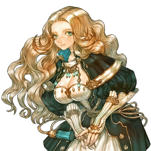
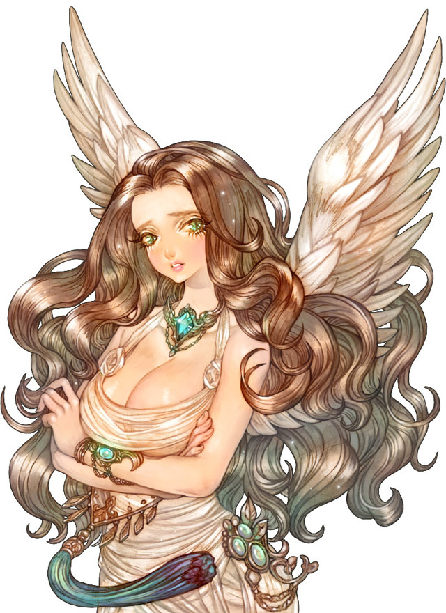
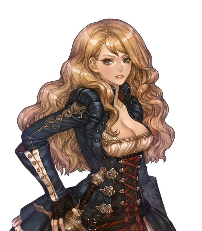
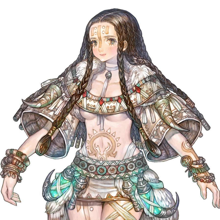
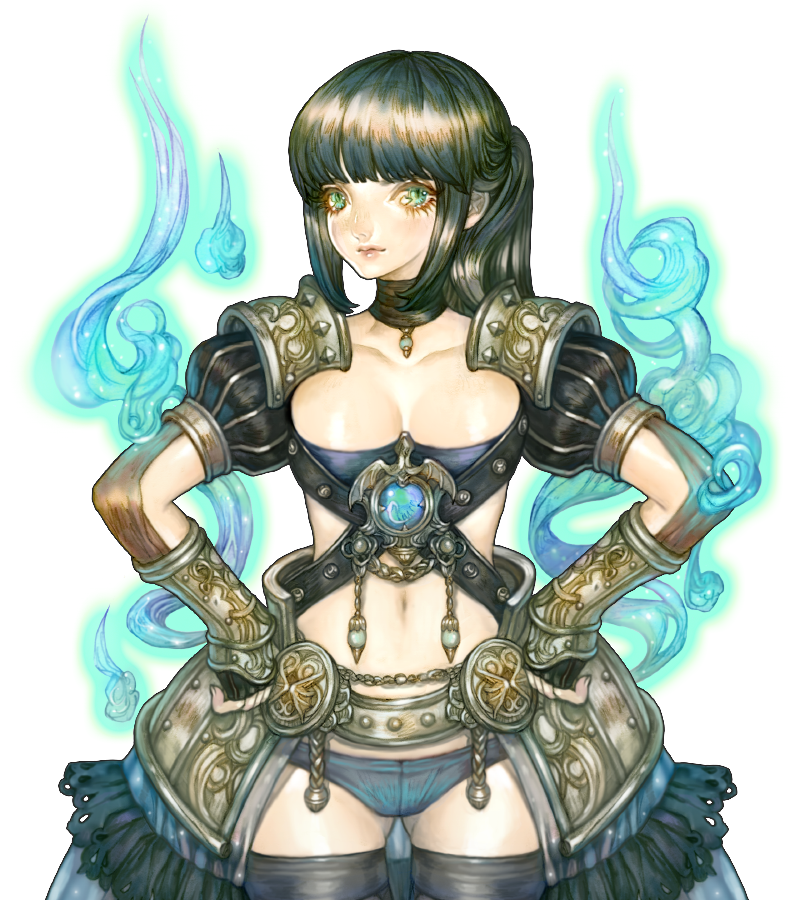
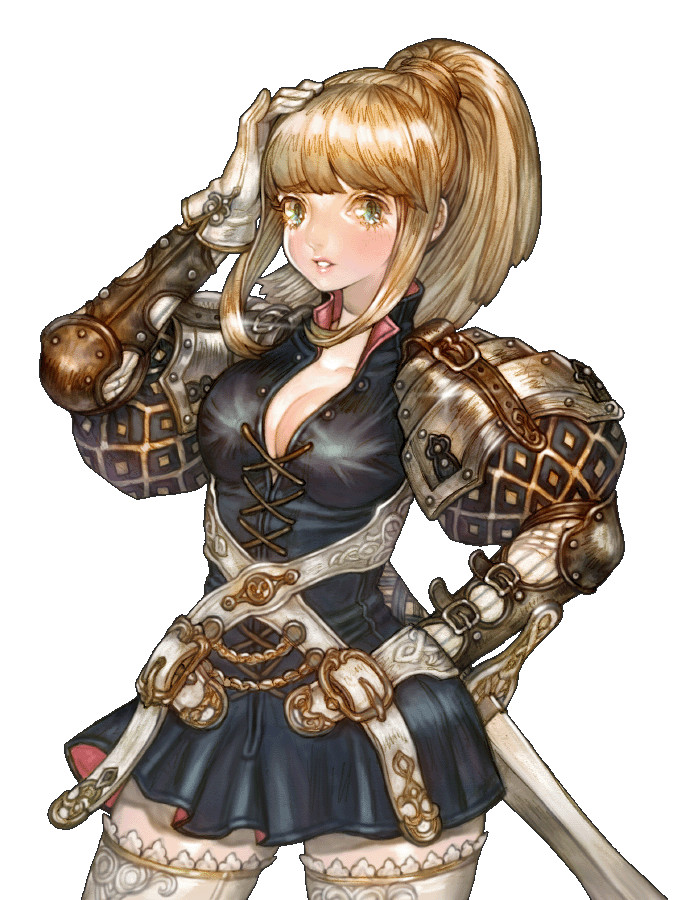
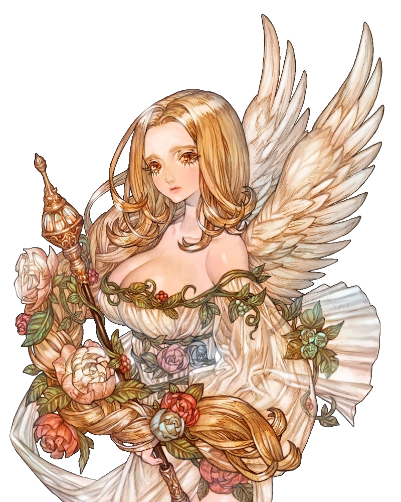
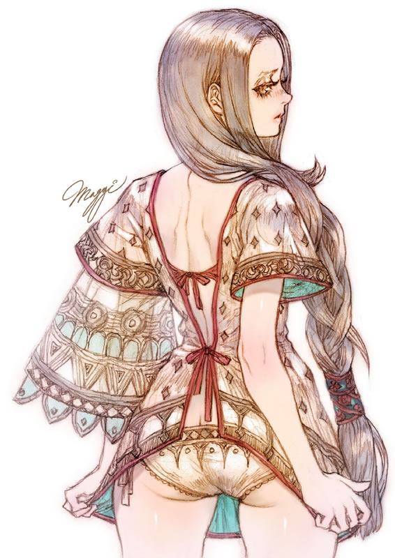
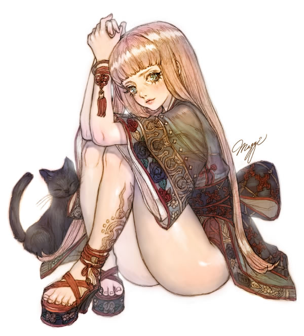
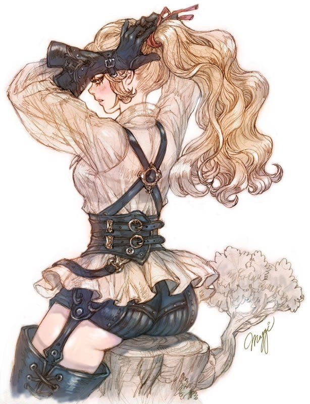
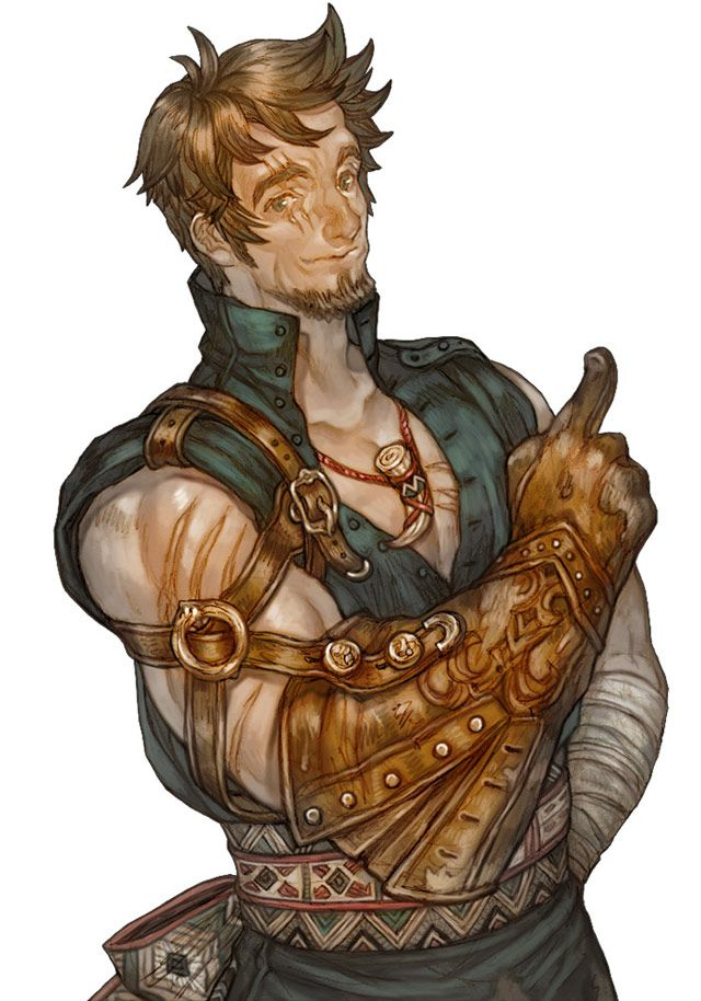
I rush made a thing. If anyone is interested, a compendium of 150+ of the ingame NPC art is available here: https://imgur.com/a/Ksfm7/all
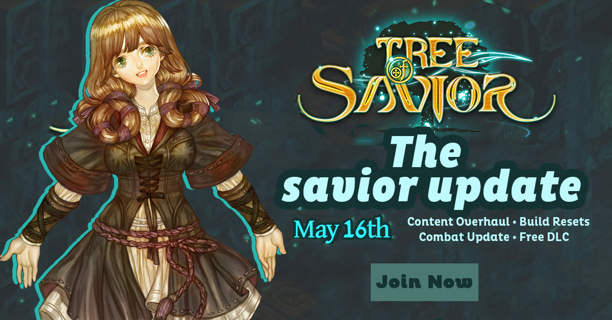
I don’t like my button. Some things are off centre. I didn’t bother fixing the cutout edges of the logo.
I think the update should be named. I went with savior because it’s game brand relevant annnnd plays on what people pretty much all want to see the update do. I can see the potential for it to be an admission that the game needs saving though, which I expect some in management might dislike a lot. Square did exactly that with FF however and it paid off big time for them with Rebirth, but of course they followed-through in a big way without disappointing.
Call to actions should also be buttons in my opinion.
I don’t see why there’s a need to say “coming May 16th 2017”. The year is obvious. The “coming” is unnecessary and a waste of valuable space to throw other things up there, it’s implied by the date anyway.
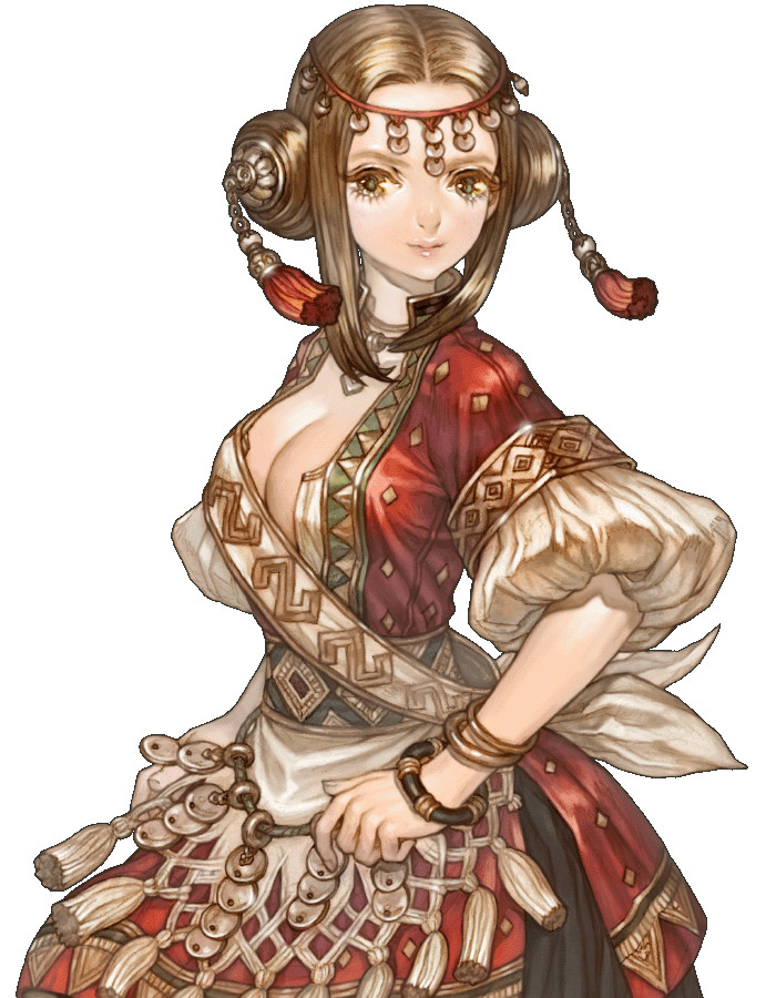
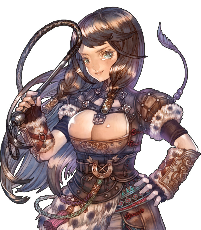
People complaining about use of the art - It’s an anime game. It’s key selling point is “Cute anime characters on an adventure”. The anime art communicates that, and the fact that Maggi’s art is unique and eye-catching is a plus. I would agree if Maggi’s art were incredibly generic standard anime art where every character looks like every other anime character ever made but with different hair/outfits, but it’s not at all.
Definitely could make use of ingame characters like the first image, I strongly dislike the font choice in the example though.
Strongly like the colour choices on the second image, and the gradient. Did somebody forget to remove a dropshadow though? There’s a single colour huge shadow over the very centre of the image that doesn’t match any existing shapes. If it’s supposed to be a hint to what the DLC is, it doesn’t communicate it very well.
Looking forwards to the update.
EDIT: I’m also realllly not a fan of covering the logo in text, even the small amount at the bottom. It’s really bad brand management practice, I was just being very lazy.