What was wrong with the old one? I kinda liked it more, but oh well, this one has its charm too. 
Here’s a quick comparison…
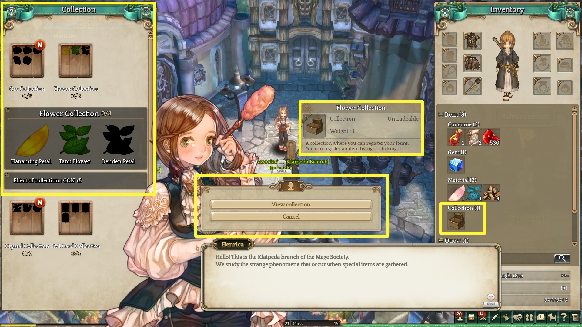
^ New UI look
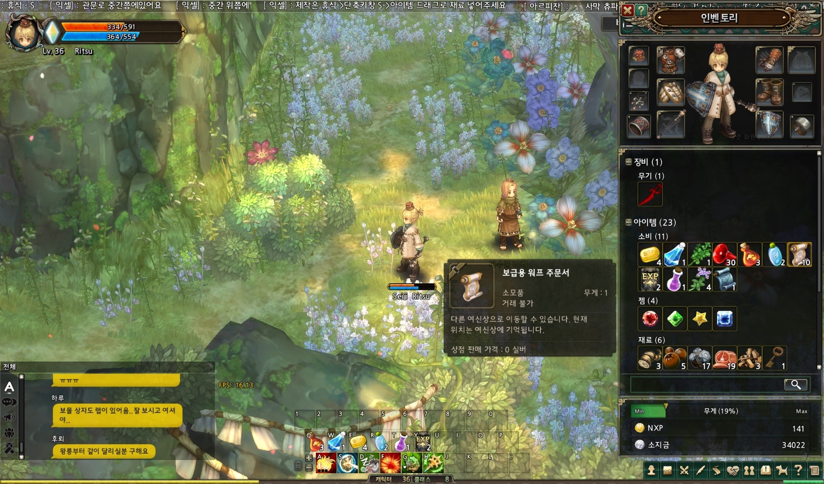
^ Old UI look
What was wrong with the old one? I kinda liked it more, but oh well, this one has its charm too.
Here’s a quick comparison…
^ New UI look
^ Old UI look
It may be a new UI, or possibly different UI skins will be available.
Yes, I think it would be nice if it was the latter.
I hope we get a few, if not, I’d rather have the old one.
I hope we can reduce the size of the UI because it sure is big. Its a little obnoxious at the moment. It takes up 80% of the screen in the first screenshot. I noticied as a Dievdirbys whenever you got a piece of wood it would pop up on the right side of the screen then scroll up as you got more. Since Dievdirbys gets a lot of wood all at once, it was this massive loot log that scrolled up. Seemed a little silly, can’t be intended…
The UI size isn’t a huge deal for shops but I’d love to see the beautiful artwork and environments without the screen being cluttered. Or I guess I’ll just run it at like 4K, can’t be too hard to run! 
or maybe its like the old RO with customizeable UI 
That’s only because there are multiple things open  my intention was to compare what the inventory looked like with the new and old UI.
True but even then a lot of things can be reduced in size. A simple UI slider should fix most of the issues. For example: Why is the text box so huge and have so much white space? Why does the symbol of the flowers in the collection have to be the size of my fist?
Heres an example of the loot list when collecting wood for Dievdirbys. Its just a little too much:
I like the black transparent one better. (Old one i believe)
I prefer the old one
I love black, I want the newer. I belive we’ll be able to choose between those 2. (And i think there were 3 cause when I look on YT on ToS vids I can see 3 another HP/SP bars)
The first screenshot was edited for better explanation.
Some UI’s are actually smaller than how it’s shown in that screenshot. 
@STAFF_Marikim does that mean the UI theme was edited from the old one to make it more understandable? Or just the UI size?
Changing a UI is a process which happens very often today.
best example is Heroes of the Storm.
Blizzard is changing/improving the UI every month.
the new UI is better in visiblity then the old one. the only issue i see currently is the font color. its not fitting to the backgrounds.
Kind regards
Gardosen
We haven’t even touch the game, yet they changed the look and feel already. Please give a feature to let players choose their preferred UI later in the game IMC! Or please add a feature to customise the transparency in the UI to our likings!
I think the idea behind this UI change is to make the UI feels more like “wood” (remember, we are talking about Tree of Savior), then it fits better with the color scheme of the game.
Honestly, I also prefer the old UI compared to the current UI, but I believe the idea of “wood UI” can be great if better developped.
Gostei da Nova Interfaice
Maybe they had to change the size of some fields to fit the english text and decided to go with a new UI. Both look good at least.
Personally, i like the new UI more - the stronger contrast makes it easier to see.
UI skinning would be an awsome feature imo