Tree of Savior Forum

Let us improve more about the forum&homepage!

  1. I agree with the above people about the website being too bright, but please don’t make it a very dark blue (it makes it gloomy).

  2. Maybe start with a darker color but not black or dark blue! Add some design on the sides too because it was so plain and is even more plain looking since the website is now white.

Examples of designs or backgrounds…

Anything that isn’t too dark with some designs in the back.

1 Like

I was actually super pleasantly surprised, wow! I kind of disliked the old webpage look. This seems to resemble something more of what I’d see in asian mmo sites which tend to be really aesthetically pleasing.

The white might be a bit hard to deal with esp with people sensitive to brightness though. I don’t like the idea of putting any sort of gaudy pattern or anything, but a night mode might be really nice.

TEAM NAME : 5thRosaSquad
SERVER: Klaipeda

Hey Im really trying to find flaws and so far theres not much to it

  1. design-wise its standard, theres not much to it, however some add-on elements would be much appreciated.
  2. server status would be nice if it were available in the Main page
  3. Would be much appreciated if all the important elements such as Facebook/Twitter/Youtube are on Top of the Page, not bottom. You want folks to click on those.
  4. the time clock is a nice touch btw
  5. keep the top simple instead of having multiple,
    eg GAME which will house all the userguide and Class and tutorial.
    FAQ should be under Support
    Sure you have Forums, but a Community Tab would really be a nice touch too introducing the arts community or even youtube creator’s contents with permissions.

6)the News section is a nice touch keeping the newest in the tab, but it would be nice to have summaries of past events/spotlights/update/patches/whatnot.

  1. alright back to the top part, dont mind me, just my idea
    you know the place where you places NEWS CLASS GUIDE FORUM… etc etc?
    try this
    Logo|GAME|STORE|FORUMS|COMMUNITY|SUPPORT|Playfor free(download game client)

on the top would be
Server status|facebook/twitter/youtube|login|create account|server time
Just a suggestion, might be awesome to think about it :smiley:

p.s. someone mentioned night mode, i would love that too. I know white is prim and proper and all that. it is a little too much for my eyes.

God please take this white background away, otherwise I think it is looking pretty good… I will take a better look after the white background is gone, for now is just too much light to look at it.

So bright. I can’t last reading the comments for 5 mins. T_T

  1. Love it. Will you be adding the hidden classes to the class list?
  2. Please it is too bright! Dark mode for both forums and main site.
  3. Nothing as of yet.

TOO BRIGHT! DARK MODE PLEASE!

Site is OK, even with the white.

But bring back a dark background to the forum, PLEASE! T.T

Maybe a darker grayscale is already fine.

bring back the dark background color for the forum. the white color makes my eyes sore

12 Likes

I can’t read anything on this white background amgfdgdfgjdsakfjdslafes

I want the dark theme back! I hate white backgrounds when browsing forums and I’d like the option to choose.

The forum was fine as it was.

It’s very beautiful and clean the way it is, the only problem is that can hurt the eyes.
Maybe a solution is to change the saturation and/or make a darker theme(the old one?).

edit: I think it’s just a matter of time to get used to it(like the bugs in the game).

Its too bright!! can’t see what I’m reading…

font size doesn’t match the white background even wearing the glasses

1 Like

Hmm where to start…, here are my comments and suggestions

Design

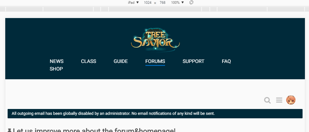
The background colors can be further improved. Currently the break in-between the dark elements and light elements is too drastic, making it really ‘glaring’ to the user. An example is the section dividing the Profile UI elements, section “All outgoing email has been…”. A sudden dark divider like that will stick out making it really harsh to read.

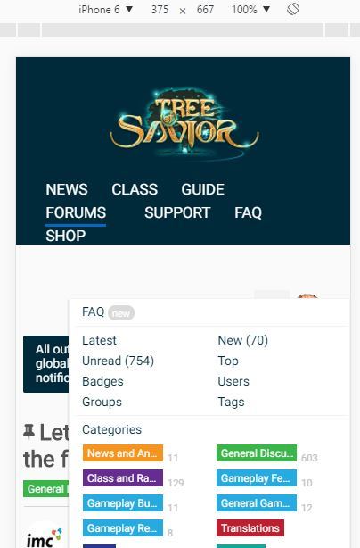
The grey and soft colors for call to action buttons such as Reply, likes and the thread navigation widget blends in with the white background, makes it hard for users to locate and use them. Will be really great to increase their color saturation.

Not really into splitting up of the top level menu with logo in the middle. Now currently there are only 7 items in the top menu and it looks lopsided. When there are more navigation items it will be hard to balance. In responsive mode (iPad landscape) the menu drops down, need to extend the width of the navigation. A simple change of color to yellow instead of underline for hovers and actives will make it looks more complete.

iPhone is also the same, maybe a hamburger menu will do nicely to save space.

Thread Navigation Widget

Thread navigation widget on ipad portrait (small desktops) isn’t aligned properly. Doing the margin-left with calc(100vw - 180px) will be better.

Fonts and line-heights

Line heights of body text paragraphs can be increased, it will help in making the text more legible.

2 Likes
  1. It’s too white.

  2. Change the background color.

This white background made me remember the old forum, when i was waiting the 1st iCBT… I was going to say good ol’ days, but then the day 1 release came to my mind.

I am not good at english but I will do my best

  1. I’ll be blunt, I still don’t like it.
  2. It’s too bright for my taste. I hope you make it darker or put an option to switch from dark to light vice versa.
    Scrolling to get to the next post/page is really annoying especially when you’re on mobile. I prefer the traditional style
    where there are buttons to go to your desired page.
    The right side is just too spacious.

  3. Haven’t browsed enough yet.

Team - Hillgarm
Server - Orsha

1. That’s more like the option i voted for the official scheme at the poll… i like it but as most pointed it’s too white and needs more contrast as the first forum/website version before game release. Overall the new site seem quite more informative and i love that.

2. For the following sections…

Homepage and News - Add a Maintenances/Fixes category, there are too many announcements on news feed even thou they cover different aspects.

Classes List - Make the main classes emblems/crests more visible

Class Info Page

  • Add more details to skill info
  • Add color tags (box background) to display which circle the skill bellongs to make make reading easier (ex: green - circle 1, yellow - circle 2, red - circle 3).

Rank Up - This one is quite tricky, it would be quite interesting if it worked as a calculator and grouped the selected classes in a more optimal way, it’s a nice feature but it wastes too much space for what it offers (ex: Sadhu C2).

Class Building Rankings

  • Add filters to Top 100 and Rare 100 for each class tree (making a total of 25 or 400), the current Rare 100 displays only Swordsmen builds.

Shop

  • Fix the issue that makes text show before the sliding background loads.
  • Add a tooltipe or button that explain TP and Exchange Medals for new players.
  • Add the following categories: Limited (Goddess’ Blessed Cube and Hanbock Costumes), Promotion and Bundles (ex: Penguin + 10 Sardine pack).
  • Split TP Shop and Exchange Shop in different tabs, just the 12 first itens at Exchange Shop are visible and there’s no option to browse through it.
  • Add detailed info to Exchange Shop accessories.

3. Haven’t found any major issue so far.

yes, server status need to come back even if its not real time accurate. Not many MMO has this feature on their website.

  1. Love it. Fast loading.

  2. Please it is too bright! Dark mode for both forums and main site.

  3. Haven’t found any major issue so far.

TEAM NAME: LittleDown
SERVER: Silute

1 Like