-
I like the website since a long time ago, now become more clean, lighter, i like it too.
-
I think that it’s too “wide” without margins…
-
For now, everything works fine.
Too bright!! Please give us a dark theme option!
What do you think of our website?
If I can be blunt I think it is entirely too simplistic and minimalist. It’s turned more into a blog/wiki format than it has a professional business grade website.
Is there any improvement that you would like to suggest?
Yes - First, as many others have said, dark/night mode. It’s entirely too bright. Secondly, the site tells little about the game on the front page, it has some updates, a lot of advertisements for events and one thing of lore. It needs more front page content. Preferably detailing more about what the game is about because it does have a rather extensive plot and history. Maybe throw a video up there? Think about it; a new person looking for a game isn’t going to have a clue who the Falconer master is, but a regular player will. The site is designed more for existing players and less for new ones. New players won’t know the game has 50+ classes just by looking at the front page. They won’t know the level cap is 330, that there’s multiple servers for multiple regions, but they’ll certainly know about the latest TP shop addition or the event of the week.
Consider including more easily accessible social content as well; many players are unaware of your facebook contests until someone graciously posts them on the forums or shouts in game. In general, more interactivity is good. Guides are great thus far. Maybe put some kind of little pop up helper in the corner to assist readers with what they’re looking for? Either way I’d add more front page content with newer players in mind. You have something like 3 seconds to keep a readers (potential players in this case) attention.
Forum header background is sort of plain as well, maybe superimpose an image? Just to give it texture?
(apologies if this feedback/suggestions seemed to be too harsh, I’m a marketer)
What’s not working properly?
Nothing I’ve found thus far
Damn i cant see…
nice job on the web site but this forum hurts my eyes.
Siluite
tt17
-
It’s Great, way faster loading
-
Night Mode option. It’s great for eyeballs
-
The “Submit image” at the ticket section is not working properly,
Team name: Woedenberg
Server: [SA] Silute
Too bright, maybe a lil darker pls.
Server: Silute
Team Name: Suchi
There really should be a gameplay video on the homepage as the first thing people see, along with the Play The Game link on Steam.
I don’t know why latest news is the focus. The homepage should be focused on new players joining, with latest news being the NEXT focus after that.
An exciting gameplay video is the standard for every single other game. Even ollllld games like Maplestory are up-to-date with this.
Honestly, our events and latest news stuff should have been in-game updates a long time ago too.
… nice design and organization though, good job x)
1 Like
Love the new website! keep up the hard work.
Server: Silute
Team name: Fmg
Jeez man, it’s too bright here.
Need a darker color scheme, hurts my eyes.

Team: Berrett
Server: [SA] Silute
I really liked the changes, the site’s now more beatiful and usefull.
Just the white background doesn’t look too good. Overall, everything’s great. Nice Job!
I’ve just noticed that we’ll need some new editing with the new layout. The old one didn’t displayed preview images used on each news, but when you filter each category…
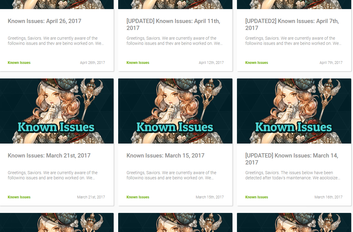
Known Issues
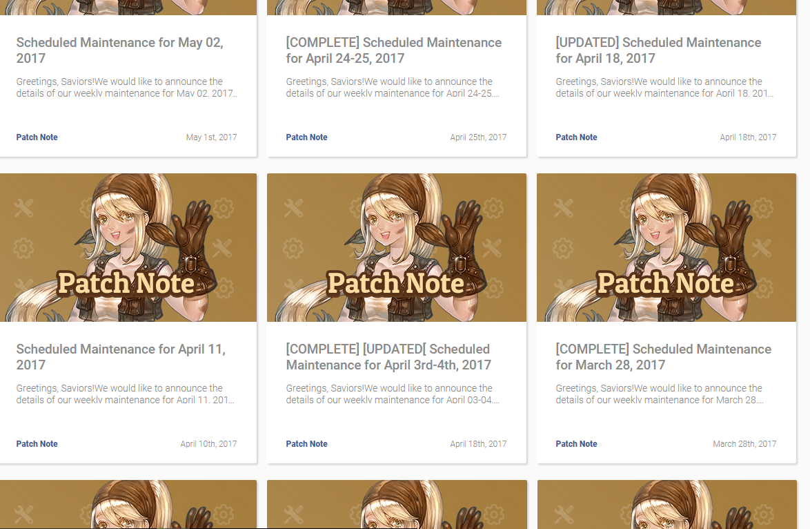
Patch Notes
Announcements
It would be great to put elements related to each information on the display picture, this will make it way easier to identify if it’s new (for the user), when it was posted and what is it about.
I would change the white background to something darker and add back the server status on the main page.
1 Like
I LIKED,
TEAM NAME: DOBI
SERVER: Klaipeda
The green and blue theme was splendid. This white mess is horrible and makes me not wanting to look into the forum anymore.
1 Like
I like the layout, but the colors could use some changing
yes, make the search on forum look like on main page (add the word Search to it so people can find it faster) and giving the options to change themes would be nice
no idea what should be proper or not right now, but there are no hidden classes on the cass section and that makes making builds misleading and annoying…
also, the server status is missing or not where it can be easy to see…
@STAFF_Yuri
Seriously, this white background needs to be switched as fast as possible. My eyes are hurting!
@STAFF_Yuri
White as background color can work but using thin grey for the letters on a white background is very problematic.
I recommend to swap to a calm beige, brown or grey tone AND change the letter color into black AND make them thicker.
Here is an example how the forum of gw2 looks like (I dont want to make commercial for this game but I dont know a better example). https://forum-de.guildwars2.com/forum
Na. Never ever white background. It’s just horrible stressing for the eyes.
Best is always to use relaxing colors and strong contrasts for readability. To be honest the coloring scheme we had before was 10/10. There wasn’t much IMC has done perfect since the beginning but this.