Suggestion:
- Night mode: Dark background
- Light mode: make the font darker abit
- Rank up section: Display more info about skills (skill points, damage, sp consumption, CD,…)
Suggestion:
it’s OK fast to loading.
I preferred it how it was to be honest

What do you think of our website?
I like the new look, it feels very sleek and intuitive. The addition of a solid player guide and overview of classes was long overdue, and it’s been implemented very well.
Is there any improvement that you would like to suggest?
First, change the forum background. Unlike elsewhere on the site, it just doesn’t work here. Darker colors would help to reduce eye strain and glare.
Then I’d suggest expanding the “Class” section of the site with more information. Having the actual numbers attached to the skill, and being able to see how they change as the skill improves would be great. It’d be helpful to have a “skill planner” functionality like the one on tos.neet.tv,
What’s not working properly?
Over in the “Shop” tab, the “Emote Plus: Popolion” has a broken or missing image. That’s all I saw in my perusal so far.

EDIT: Another thing… Patch notes section in main page pls.
EDIT2: Mobile version needs an improvement.
TEAM NAME: Sanito
SERVER: Telsiai
Dark theme ASAP! Please!
Yeah this white background is just too much strain on the eyes.
1.It nice ,feels like playing in KR sv. but it was too bright. It will be perfect with Choice of Dark Theme or make it less bright.
2.Options to make it less bright and in Class Page (Rank Up) , Make it like tosbase please. It very hard to know what we got for that class.
3.Some hyperlink , All of Class Ranking Page seem doesn’t work? Maybe?
Seizure
Make it a little darker and transparent.
Your class balancing.
Class simulator needs an upgrade. Make it so we could put skill points too. I think there is no reason to hide hidden classes in simulator. Videos to show case the skills will also greatly help,
[quote=“STAFF_Yuri, post:1, topic:359211, full:true”]I would like to ask you about those three things, but if you have more ideas! please tell us! 
What do you think of our website?
Is there any improvement that you would like to suggest?
What’s not working properly?
[/quote]
I like it. I think it’s clearer now, and most of all the Class and Guide sections are really great :3
It’s all pretty well sorted, so this pleases me quite a lot.
EDIT: When we log on the site we see right away and such clearly that one server (or several) have issues and under maintenance now, it’s really nice~
Yes. The colour. I love white, but that is too much. It’s too white, and only white. The brightness will hurt people’s eyes, but it’s also too “antiseptic”, it lacks personality. Fomer one we knew it was TOS with the background, TOS was the theme. Now it’s just way too white everywhere (a less bright white and the return of the background would be nice to me).
Overall it needs less brightness, and more different colours so we see the information better.
Since you added a Class page showing all the classes and their skills, I think it’d be nice to also add a “build planner” option (so people can try to plan/create their builds). Maybe with the possibility to save/share it so people can discuss it on the forum. Basically what other third sites like tos.neet and tosbase offer but directly on the main site.
Since it’s all white we also can’t see clearly what is quoted in one’s message, that’s pretty bad.
I’m not sure if it’s just me, but I couldn’t log in through Facebook (and thus access my tickets), it stayed on “Verifying…” forever. I had to log using Google and then log out for it to allow me to log with my FB account.
Can’t scroll down using my mouse wheel on News, Class, Guide, FAQ, and Shop pages.
Class -> Rank Up -> Cleric 3 it states for Guardian Saint “Activate Patron Saint Magic Circle”, it should be “Activate Guardian Saint Magic Circle”.
For Krivis’ Zalciai it says it “decreases enemies critical abilities”, but it decreases their resistance, not their abilities.
Dievdirbys’ Laima description is incomplete. Owl statues’ one isn’t only incomplete, but it’s not even the main use of the skill.
So overall I think you need to check all the skills’ definitions, as there are mistakes.
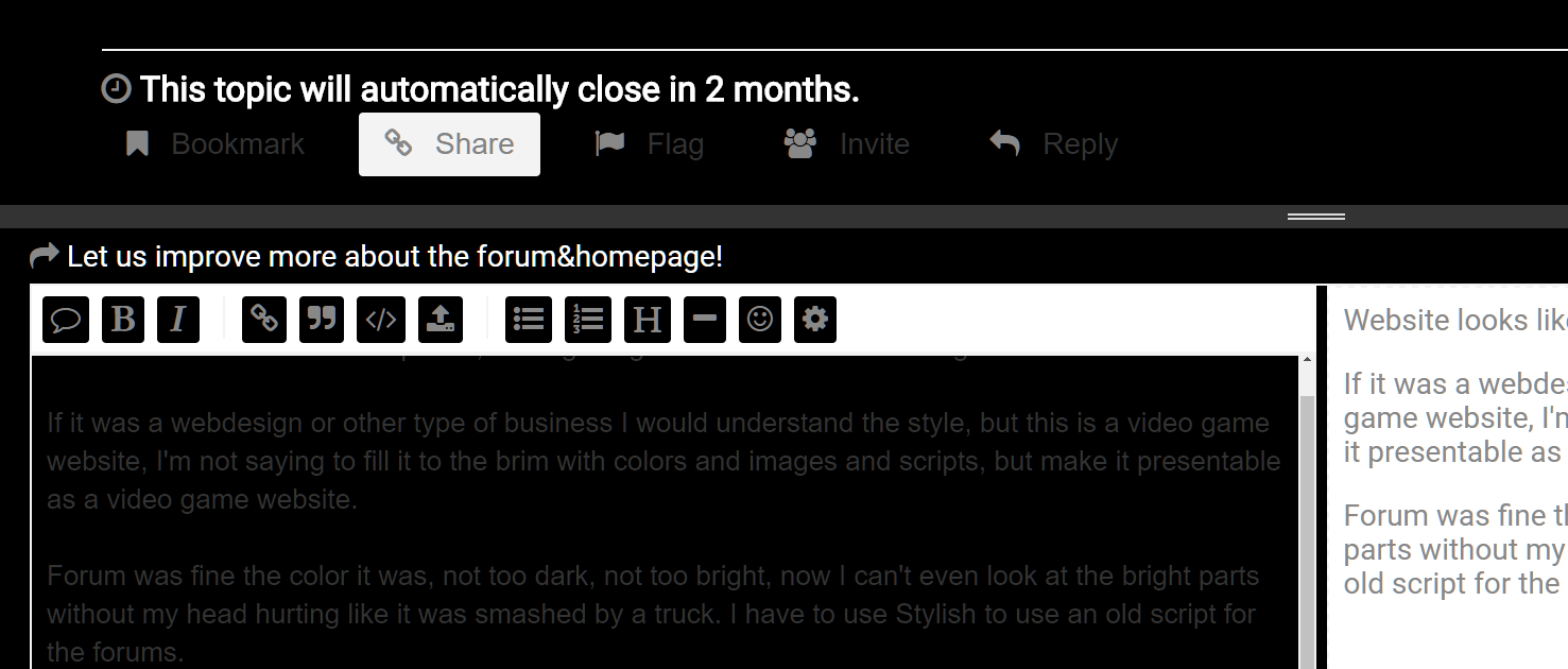
Website looks like is not completed, lacking image holders and some backgrounds.
If it was a webdesign or other type of business I would understand the style, but this is a video game website, I’m not saying to fill it to the brim with colors and images and scripts, but make it presentable as a video game website.
Forum was fine the color it was, not too dark, not too bright, now I can’t even look at the bright parts without my head hurting like it was smashed by a truck. I have to use Stylish to use an old script for the forums and as you can see, it doesn’t cover the whole place.
Now to be even more serious and pretty blunt, instead of wasting time and resources on websites and forums, do that on the game, so it work properly at least.
Overall it seems like an improvement from the old UI, the new class and ranking section is especially appealing.
As others have mentioned already, the whiteness, it hurts.
And in the Class section it would be nice to see the skills kept up to date, and showing more skill details, like all the Atk numbers each level, stuff like that, same for attributes.
In the Class Ranking section, it appears to always put hidden classes on the far right, as if that was the last class choice, rather than putting it in the order they are available / picked.
Example: Cleric c2 -> Dievdirby c3 -> Plague Doctor c2 -> Miko
Should be: Cleric c2 -> Dievdirby c3 -> Miko -> Plague Doctor c2
The website is nice. The forums are nice. Everything is very nicely laid out. We can even REPLY to support tickets now which is a huge bonus.
The white backgrounds MUST go. The art frame and nice coloured background we had previously was very comfortable and suited the game. A white background is not at all tos-like.
I won’t be able to use the forum at night anymore as it will wake up my partner who will be asleep in the same room, flooding the room with light. Not to mention that the white has made everyone’s avatar look terrible, the colour previously worked as a nice accent.
Words cannot describe how much i hate this new format.
It literally makes my eyes hurt, its too damn bright, it dosent feel like anyone gave any tought into this at all, just feel like someone deleted all the background art by mistake.
This feels like something youd get as stand in for wen the website is under maintnace or something.
You cant even see most of the elements, like how many view on post for example is the thread is grayed out on the list, and thats something in itself, it dosent get grayed out it disapears couse everything is so damn bright.
Theres no visual guide lines guiding you to borders, limits or buttons, just white on white, its absolutly horrid, please change it back.
I used to love this website it was very nice smooth, simple, well designed, very intuitive, everything checked the list.
Now its beyond garbage, something someone in doing a course would make as a last night. last minute rush job-
Id ask the person that made this for money, not pay him, thats how bad this is.
Sorry to be so harsh but im just telling it how i feel about it, you want feedback, this is mine, its absolute garbage please change it back for the love of god.
Please change the forums white background to a dimmer one. Or simply put outlines.
IMO we should have the option on what color/theme we want.
white/black/blue
i like this current format at work, makes it look like i’m just reading a document and not a game forum. At home tho, i prefer the blue one, or even a gray/black one if that would be available in the future.
White background is horrid. Backlight usage over 9000.
Change it, change it now!
1)Too much bright, it’s bad for the sight. Maybe make it a light grey and add another darker option (let’s say a dark blue).
2)The class builder is nice, but if it was to be improved into a proper skill builder it would be better.
I want it to be more darker than just plain white (because this hurt my eye) and the skill level for each class added would be great.
other than that im happy with it
The new design looks impressive, but there’s too much white in it, especially in the forums.
I suggest to use the same color as the banner to paint that white background.