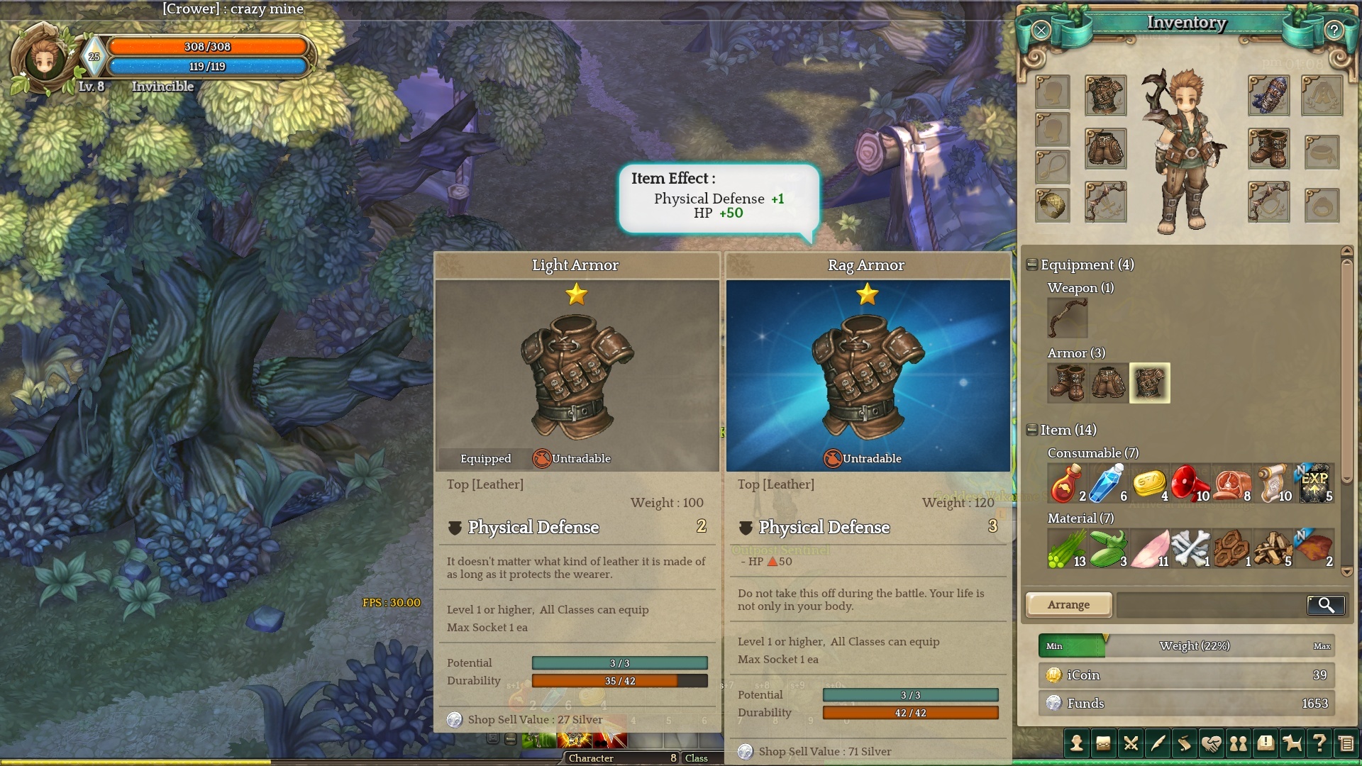
“-” sign at the beginning of item bonus followed by red arrow confuses me a lot. I suggest to remove that minus sign and re-color arrow into green if the bonus is better that on item equipped.
6 Likes
I think they more or less fixed this.
Negative effects have a downward facing triangle now.
Psychologists say that human brain process color information way faster than shape, that’s why changing shape isn’t the best option =)
1 Like
Plus we’re used to
Green = good
Red = bad
And afaik here is the other way around, right?
1 Like
And the People with an Red-green color vision deficiency? 
I think Green and Red are not the best Colors.
So shapes solve that problem.
I associate green with good, and red with bad, as well. But it’s clear now.
1 Like
yer I found this confusing at first too. probably would be better if green was up and red was down and they also got rid of the minus sign.
I agree on the fact that up arrows indicating stat increase must be green/blue, and decrease should be red.
That, and replace the “-” with “+” or get rid of it altogether - I almost vendored a piece of armor after reading the flavor text and seeing a “- HP” line. It should read “HP +40 [green up arrow]”, NOT “-HP 40 [red up arrow”].