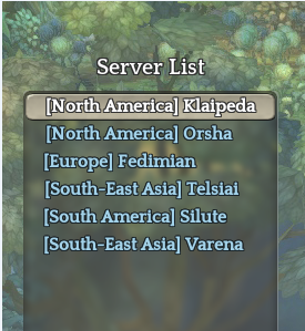
I really hope this is unintended.
Turn them back to NA,SEA,EU etc. please.

I think the tags on server list is okay, because some kids/children playing don’t really know what they mean. Or even some adults?
Sends ticket to IMC
"I thought SA was South Asia!!! omg transfer me to SEA pls"
No, they need to fix the design once and for all.
The entries in the server list need more padding. Where you have the space, you don’t need to make such stuff that small.
The font of the actual names need to be bolder and a slightly different hue relative to the region name.
In-game, it’s enough if the region name is either below, next to the name in the party list on the left of the screen, or only when hovering the party list entry with the mouse. The actual play-field doesn’t need such bloat, obviously the neither does the chat bubble or chat window.
If you want to prevent people getting confused over similar names due to cross-server runs, add a button/selector either over the TP button or in the settings menu - no chat functions, please - to toggle ( both|chat only|below char only) shortened server indicators ( NA, SA, SEA, EU).
To be honest, i’d be ok with letting the server list have it, but in game it’s just really silly, it obscures everything in chat bubbles, breaks names further and we don’t need to see it at all.

i.e Why is there that random massive space?
Some formatting is necessary again.
The information displayed under characters in cross-server locations needs to be re-done, do you honestly need to know that xprincessmonk2k17 is playing from america and orsha?
To add further, we’re already restricted to playing with the current regions… we’re not going to suddenly see a wild [Fedimian] to spice things up, because that’s in EU. maybe in the future perhaps.
I’m just unhappy that it looks as if it had fallen down some stairs, had a really bad day and was forced to make an appearance in game. (This is not @ the server-list image by the way. )
Yeah, I thought you were pointing on both since you have the server list picture too, but for the dungeons I’m fine with either.
sadly some people are so dumb they don’t know what things like NA and SEA stand for 
But yea it is annoying how it ■■■■■ up chat.
yeah and it’s ugly too