“IMC” stands for what?
The visual signature of the company is a little sophisticated too.
As a designer, I wonder what it is…
“IMC” stands for what?
The visual signature of the company is a little sophisticated too.
As a designer, I wonder what it is…
I make cash?
420charablazit
I like the filename.
I saved my of work mostly like that. Such as:
lol
lol1
lol3
lelelel
asdasdad
Hope the staff don’t mind it.
I’m glad that their site is actually in english too. Thanks for the link. @MadHatter too.
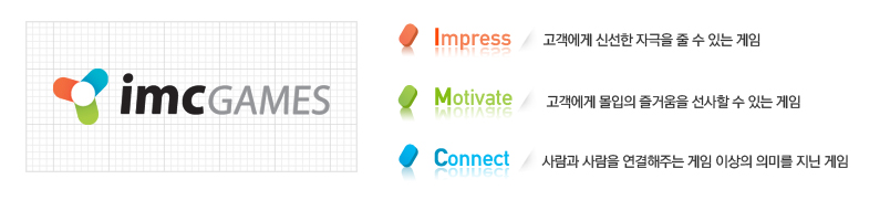
It’s a cool setup, why these three colors anyway…
Maybe its just simply cause they are the complementary colors… dunno got no knowledge regarding design whatsoever…? ^^
Those colours represents the tagline. For example, blue has often been used to represents ‘connectivity’ or ‘link’, and so on with the rest.
If they want to show strength in their words, they must have used strong colors.
As their tagline, @MadHatter
Or the maximum saturation, but these three colors are quite mild.
I didn’t dislike tho…
I’m just chilling out and talking about these random things.
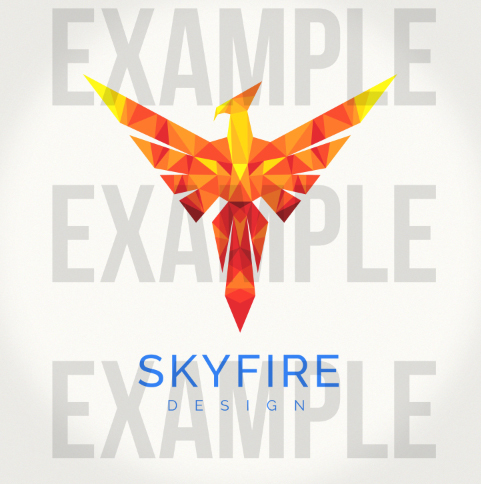
Strong colours/Primary colours are needed for minimalism logo to bring out their potential, depends on the logo itself actually (for example I would use thistle/lavender blush for soft products such as ice cream). Usually it can be 1 to 3 colours. Here’s an example of mine:
It’s nice to see how they balanced the text.
“IMC” in lower case and “games” with the capitals, it’s a good trick.
Not sure if they’ve done it yet but I think it would be nice to input the colours into IMC alphabet, matches up clean and sleek theme, just like google. Personally, I prefer a negative space logo, it’s amazing once you get it right.
A mere example:
They probally have made a piece with this idea. And one with the visual triangle-ish with just the “IMC” below.
You already made the best selection of which color in the letter should be used. But the “games” in bold black is a little harsh.
They put their triangle-ish symbol on the upper-right, it’s funny. It’s like a mark to remember or correction.
" imcgames* "
" reminder* "
Actually, it’s a messy magic wand doing to select out the word ‘GAME’ out of the logo (don’t have any specific font for it), click, click, bam. So yeah, it took out some broken/feathered pixel when I cut it thus made it bold especially putting in other colours. It was supposed to be slim.
Did tried to have it Black or Dark Grey cause I prefer it to be that way when the background is white. Much like a negative effect photo.Having a light grey isn’t my taste but that’s just me.
It’s good to read in that way too.
And the phrase have a good legibility. I’m brazilian, so even if you’re reading letters, you have to use some accents with the voice.
I - M - C Games
Letter, letter, letter, word, it’s have a own break. In english feels weird tho…