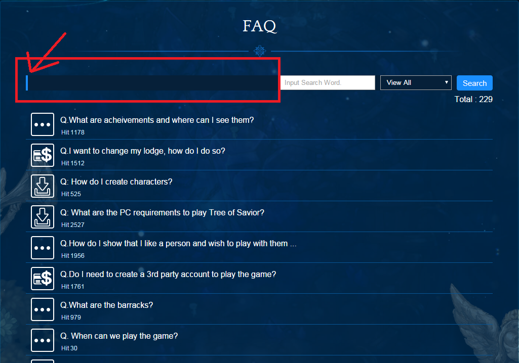
Can you remove this “box” highlighted below, or at the very least the blue line?
Every time I go to FAQ page my eyes are immediately drawn to the area highlighted below. It looks like a search box, and that random blue line looks like a text cursor.
I am not sure if I am the only one who does this, but the last 5 or so times I have gone to the FAQ page I have tried typing into that fake “box”. I have even tried refreshing the page when I couldn’t type anything there. You would think I would have learned after the first time, but it just looks SO much like a search box!
If I didn’t know better I would think you designed it like that just to troll me. 
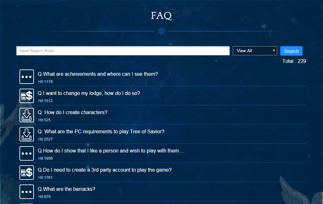
If it looked more like this:
Or this:
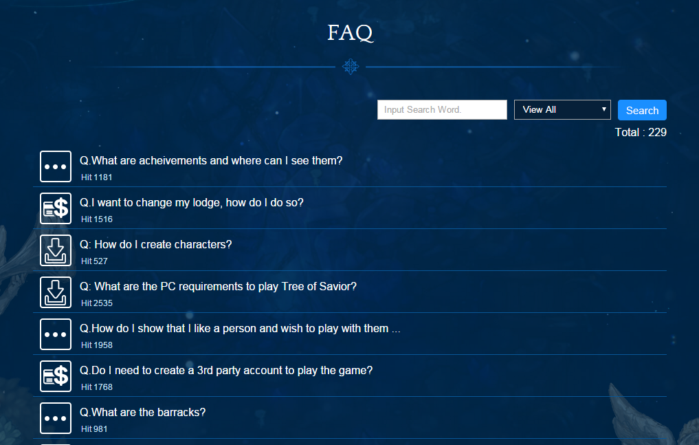
I would be a much happier camper. 