And now for something completely different.
I’m sure it’s not important to most players, but I’d like to talk about the colors of the class icons.


Supposedly, the initial idea behind it was that the color indicates what kind of class a class is, in a simplified general way, or at least what it’s intended to be.
So red would be damage-dealing classes, blue are defensive, green are support and yellow being the non-combat classes (it seems like a shop-class icon now, since summoners got their own color and most crafting classes changed to red/green)
IMC has been slowly changing some class icons 1-3 at a time once every other big update or so… sometimes just changing a class to another colour without many people noticing… other times adding a new colour, like purple to represent summon-based classes, and white as a unique color for templars.
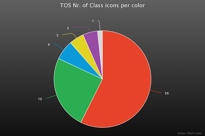
This is the representation of each color with the classes at point of Re:Build update. (Although the distribution hasn’t changed much since the beginning)
out of 61 classes, 35 of them are red, 15 are green and the rest are hardly present.
Which begs the question… are the current colors any good if over half the classes are red while specific gimmicky classes have their own color despite being literally 3 in total?
The first suggestion I think of in this situation is that red could be split into several colors.
For example:
-Red = direct damage
-Brown = indirect damage (installations, companion…)
-Orange = CC (freeze, stun, debuffs)
Or anther one would be to distinguish magic, melee and ranged damage.
Perhaps a color for mount-focused classes would make sense as well.
…and then there is the topic of individual class icon designs.
So far, the only class to get (not just colour or hidden-class decoration, but) their symbol changed, has been Scout
 ----->
There is other classes where one could argue that the current symbol doesn’t represent their concept well.


Rogue and Hakka cannot use crossbows at all after Re:Build, so it makes no sense for thei icons to clearly feature crossbows for example.

SR being completely reliant on using pistol-subweapons, can’t wield shields if they want to use any of their skills.
And then there’s some subjective cases that don’t feel good enough.

I mean sure, a horseshoe. But none of the pets (besides the Templar exclusive summoned mount) are even remotely anything resembling horses.

Fencer icon has always looked misleading for featuring two rapiers.

BArbarian could be more interesting if one of the featured weapons was a blunt-weapon, to show how they could just pick up whatever and go crazy with it (that they aren’t really tied to any specific weapon)
Anyone got other examples?


